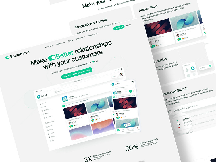
Bettermode Landing UI Design
After a benchmark on rivals like Circle, decided to go with this new redesign for Bettermode marketing landing page.
Using a drag & drop simulator for a better showcase of what happens inside the product, without the need for signup. Users can drag and drop items, change colors or swap the logo or font!
Took some time exploring different features of the product, visualized them with feature blocks in the landing page.
Going for a new look?
HMU at echreza@gmail.com . I'm helping companies and startups boost their brand with new design and looks!
More by ECH⚡️ View profile
Like


