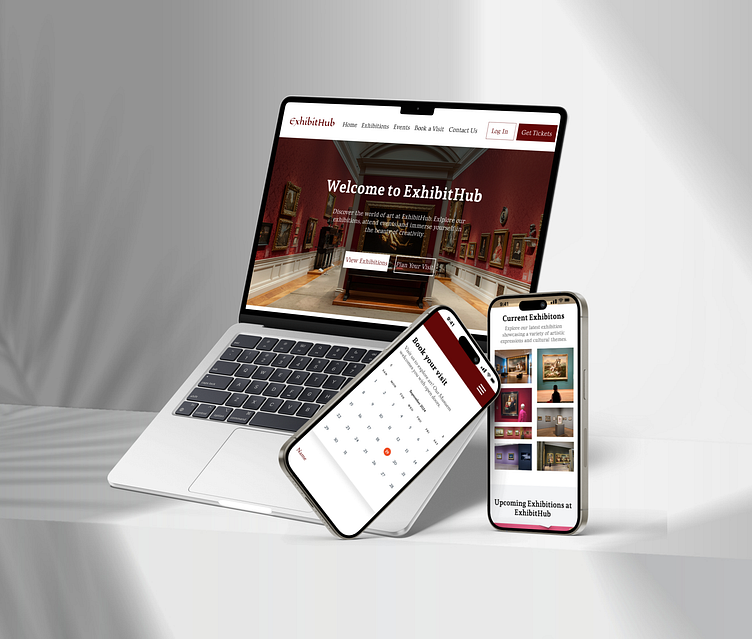
ExhibitHub - A Responsive Website
ExhibitHub - A Responsive Website
ExhibitHub is a modern platform designed to connect visitors with a public art museum’s exhibitions and events. It simplifies the process of finding event details, exploring pricing options, and booking tickets, providing a smooth and engaging experience for art lovers, families, students, and educators.
My Role:
UX Research
Wireframing
Useability Testing
Hi-fidelity prototype
Problem Statement:
As a visitor, you want to explore the museum, but the website often feels like a frustrating maze. With scattered details and a complicated booking process, finding the right exhibitions and securing tickets becomes a hassle. What could we provide to enhance your experience?
Problem Solution:
I created ExhibitHub—a user-friendly platform that streamlines the process of discovering exhibitions and booking tickets. With clear information, easy navigation, and simple booking options, ExhibitHub transforms your visit into an enjoyable and inspiring experience right from the start.
User Persona:
The next step was creating a user persona, Daniel Lee, a regular museum visitor who wants a simple way to explore and book exhibitions. This persona guided the design choices to solve common user frustrations.
Empathy Map
The next step involved creating an empathy map to gain deeper insights into the user experiences, thoughts, and feelings. It helped identify what users observe, think, feel, and does when planning a museum visit. By understanding motivations and frustrations, ExhibitHub could be better tailored to meet user needs and enhance the overall experience.
Site Map:
Digital Wireframes:
Following the empathy mapping, a digital wireframe was created to visualize the structure and layout of ExhibitHub. This wireframe outlines key features and functionalities, providing a clear blueprint for the user interface. It ensures that the design aligns with user needs, making navigation intuitive.
Next, here are the wireframes for the mobile screens. Each design is optimized for smaller displays.
Typography:
The typography for ExhibitHub includes three fonts: Andada Pro, a versatile serif that enhances readability; Lusitana, a modern serif that adds elegance; and Luxurious Roman, an ornate serif that provides a sophisticated flair. Together, they create a cohesive visual identity for the museum & uses a deep maroon shade, #630808, as the primary color. This hue adds sophistication and enhances readability, reflecting the museum's artistic identity while creating a strong visual impact.
Mockups and Prototypes:
Next, high-fidelity mockups and interactive prototypes were created from the wireframe. These designs illustrated the user interface and allowed for hands-on testing. This step provided valuable feedback from real users, ensuring that the final design was both visually appealing and functional, effectively meeting user needs.
Responsive design:
Prototype
Conclusion:
In designing ExhibitHub, a user-centered approach was essential in creating a visually appealing and functional platform for museum visitors. By prioritizing key elements such as intuitive navigation, responsive design, and thoughtful typography, ExhibitHub effectively showcases exhibitions and events while enhancing the overall user experience. This project not only meets the needs of the museum and its patrons but also fosters a deeper appreciation for art and culture.


