Rophotic - Brand Guideline Design
Hello👋
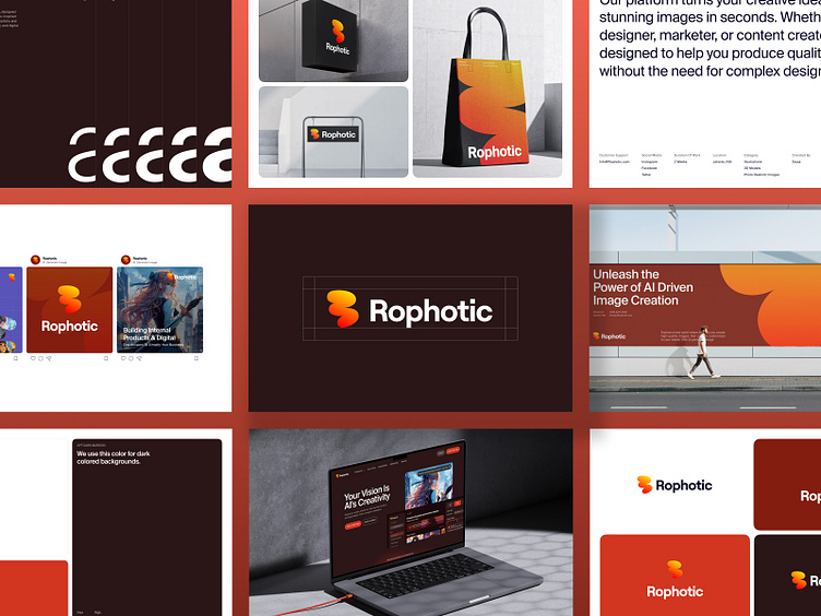
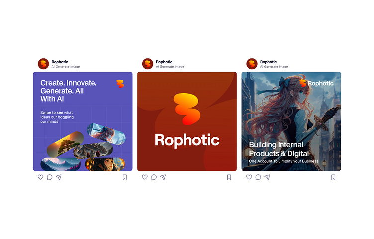
I’m excited to share the third shoot in my Rophotic design series, following the dashboard and web concepts from my previous post. This time, I’ve created a comprehensive style guide for Rophotic, showcasing the brand’s visual identity.
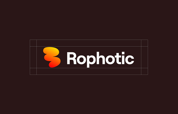
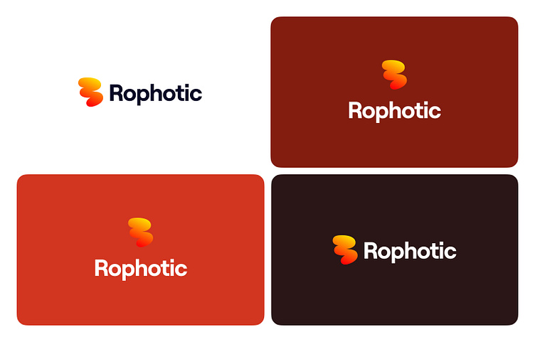
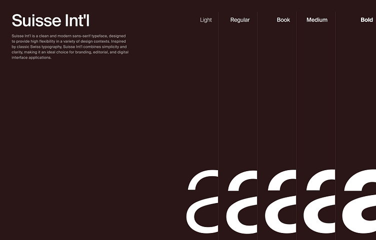
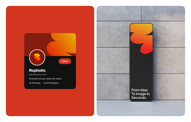
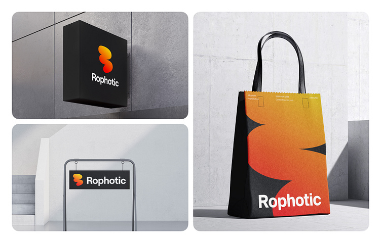
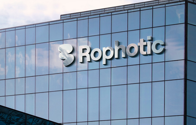
In this shoot, you’ll find a breakdown of the logo design, color palette, font choices, and how it all comes together to create a cohesive, modern look for the brand.
About Clients and Business
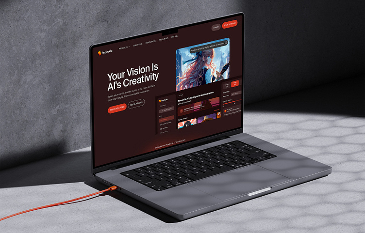
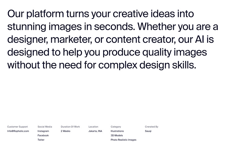
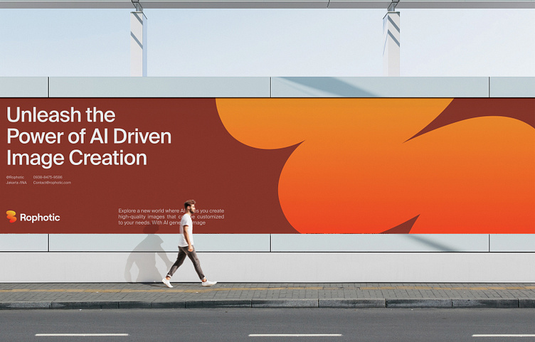
Rophotic is an AI-powered image generation platform designed to change the way designers generate images. With a focus on making AI generation easier to use, Rophotic offers a seamless, technology-driven experience that modernizes legacy AI generation. The dashboard simplifies AI image generation and helps users achieve their design goals even better.
Target Audience
Rophotic was created for young, tech-savvy individuals looking for an AI-generated experience that feels modern and engaging like their everyday lives. Aiming to make designing fun and easy, Rophotic appeals to those who want to make designing easier and faster without having to spend a lot of time searching for suitable images.
Appearance and Impression
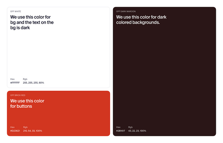
Rophotic embodies a forward-thinking, passionate, and dynamic personality. The color scheme of this dashboard revolves around maroon, which symbolizes Professionalism and Formality. The design language is modern, with smooth and flowing elements that reflect the easy-to-use and easy-to-understand nature of the dashboard. By leveraging AI technology, Rophotic creates a fresh and personalized experience for each user, which sets it apart from other AI-generated image dashboards.