7 YAKITORI MONDEN | LOGO DESIGN & BRAND IDENTITY
7 Yakitori Monden restaurant was born with the mission of providing customers with traditional dishes of the beautiful country of Japan. With dedicated service and cozy space, 7 Yakitori Monden hopes to be a familiar destination for every customer who loves Japanese cuisine.
The brand identity of 7 Yakitori Monden restaurant was designed by Bee Art using 3 main colors: 3 basic tones: black - red - white, these are colors with strong contrast, thus helping to easily impress customers at first sight. Black represents luxury and class, while symbolizing enthusiasm, energy and the traditional spirit of Japanese cuisine. White represents cleanliness and sophistication. The combination of these 3 colors not only helps the brand to be easily recognized but also shows the modern and attractive style of the restaurant.
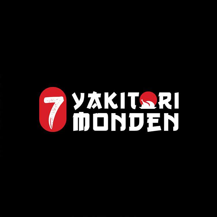
The 7 Yakitori Monden restaurant logo is designed with a stylized brand name using a strong font with angular strokes in Japanese style to show the solidity and prestige of the brand, while maintaining its uniqueness, creativity and easy recognition. In addition, the letter O is also stylized into a red sun symbol - a typical symbol of Japan with a message of fertility, development and longevity. At the same time, combined with the image of a chicken thigh helps highlight the brand's main business product. Overall, it creates a creative logo, balancing traditional and modern elements suitable for a Japanese restaurant.
-
Client 7 Yakitori Monden
Logo Design Project. Logo is designed for Japanese Restaurant.
Copyright© Bee Art. All Right Reserved
Contact us:
• Hotline/ Zalo: (+84) 77 34567 18
• Email: info@beeart.vn
• Website: www.beeart.vn
• Facebook: https://www.facebook.com/BeeArt.vn


