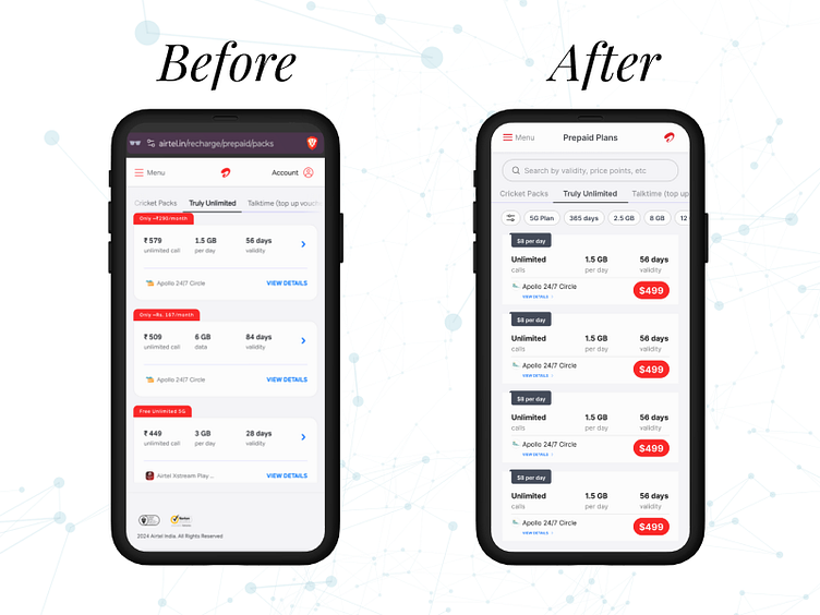
UX Challenge: Airtel plan listing page redesign
Problem statement:
Indian telecom operators recently increased tariffs by ~20%, making the plans pages more important for customers, as they look to optimise their spends vs value received. Airtel is one such operator that has increased tariffs. Improve the design of this plans listing page so as to ensure that customers are easily able to understand plan benefits and compare them.
My understanding:
Airtel has increased rates so plans page is more important now. As user will re-evaluate spend vs value received. So I will improve the design to ensure the design is easily understood, scannable so they can evaluate the screen faster and take their final call with much ease & less effort.
More by Hardi Parmar View profile
Like
