Shoes Shopping App UI
Shoes Shopping App UI
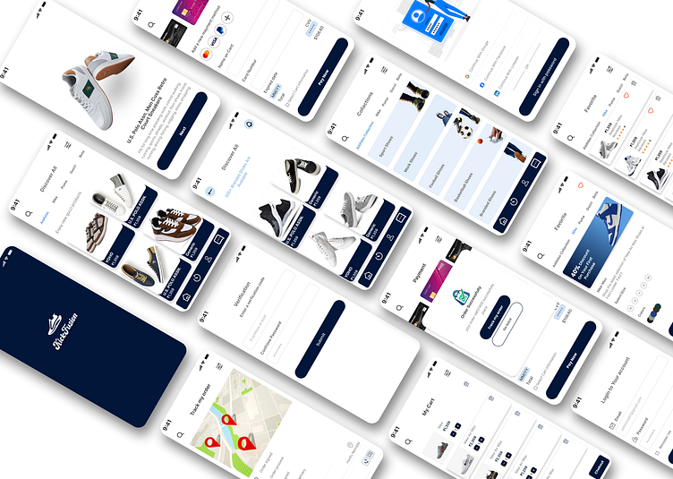
Objective: The aim was to design a visually appealing and user-friendly shoes shopping app. The design focuses purely on UI elements, with the goal of creating a seamless browsing and purchasing experience for users.
Screens Designed:
Splash Screen: A minimalist introduction with the brand logo to set the tone.
Welcome Screens: Featuring high-quality shoe images to capture the user’s attention and encourage engagement.
Get Started (Login & Sign Up): Clean and straightforward screens for easy access and onboarding.
Verification: Ensures secure account creation and login with a simple design.
Discovery Screen: A product grid showcasing various shoes with filtering options for quick navigation.
Product Details Screen: Highlights product images with essential details like price, size, and color.
Search and Filters: Helps users find specific shoes through an intuitive search function and filter options.
Cart & Checkout: A user-friendly, step-by-step checkout flow to complete purchases with ease.
Profile & Location: Provides users with access to account management, delivery addresses, and order tracking.
Tools Used: [Figma]
Design Focus: The design emphasizes clean layouts, consistency, and user-centered aesthetics to create a visually engaging app that is easy to navigate and enhances the overall shopping experience.
I’d love to hear your thoughts on this design! Feel free to leave feedback or suggestions in the comments let's connect and grow together as a creative community.


