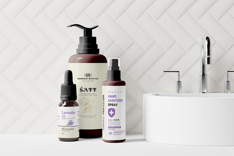
Pump bottle, Dropper, Spray Bottle Label design for Packaging
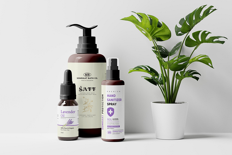
packaging design for pump bottles, droppers, and spray bottles. Each of these designs plays a crucial role in enhancing the user experience and communicating the essence of the product.
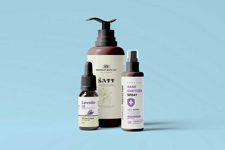
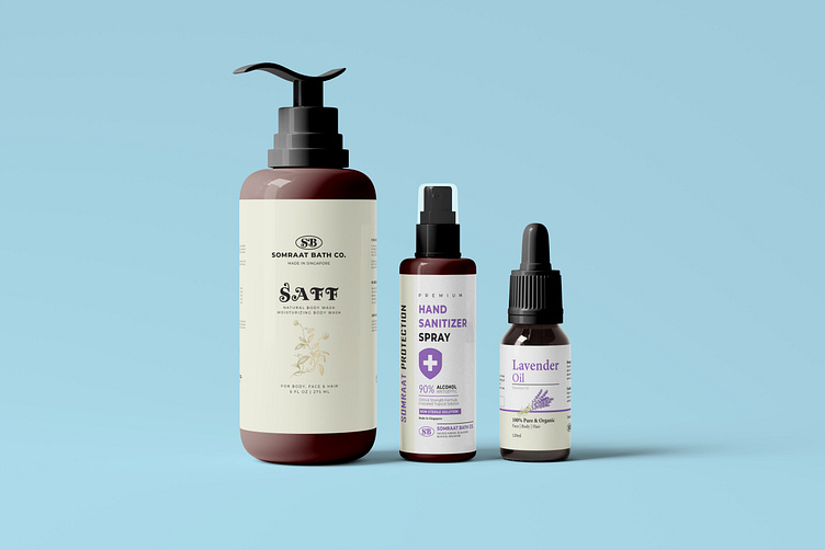
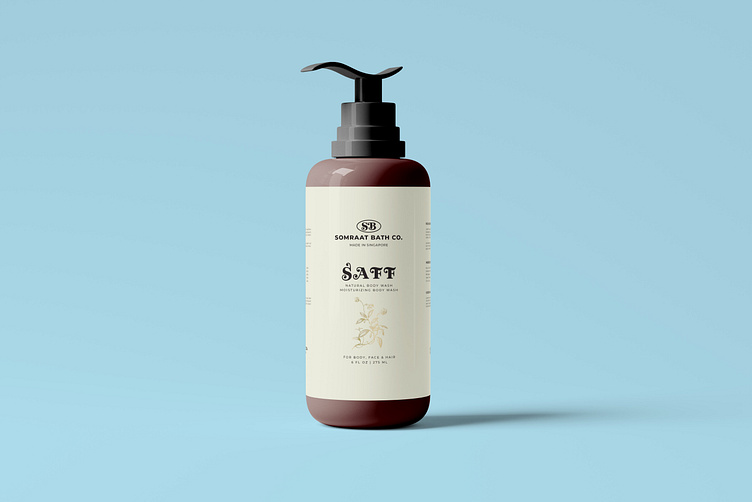
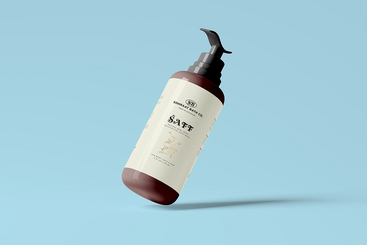
Pump Bottle Label Design:
Elegance Meets Functionality: The pump bottle label exudes sophistication. A minimalist layout with a sans-serif font ensures clarity. The color palette—perhaps a serene white or muted pastel—invites trust. The label prominently displays the product name (e.g., “Hydrating Serum”) and key benefits (e.g., “Boosts Radiance”). The pump mechanism promises ease of use—a gentle press, and the liquid emerges. It’s a design that whispers luxury and practicality.
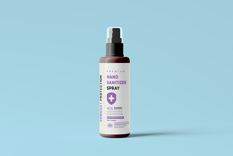
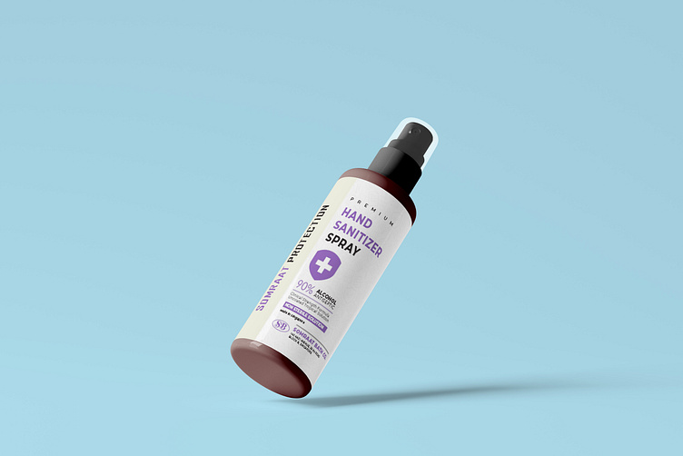
Spray Bottle Label Design:
Mist of Freshness: The spray bottle label dances with vitality. The bottle, transparent or frosted, reveals the liquid within. The label background—cool aqua or leafy green—conjures freshness. Bold typography announces the purpose (e.g., “Facial Toner”). Beneath it, a playful tagline (e.g., “Revitalize Your Skin”). The spray nozzle, like a gentle breeze, delivers a fine mist. It’s a design that celebrates rejuvenation and invigoration.
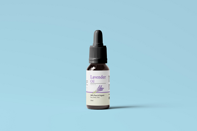
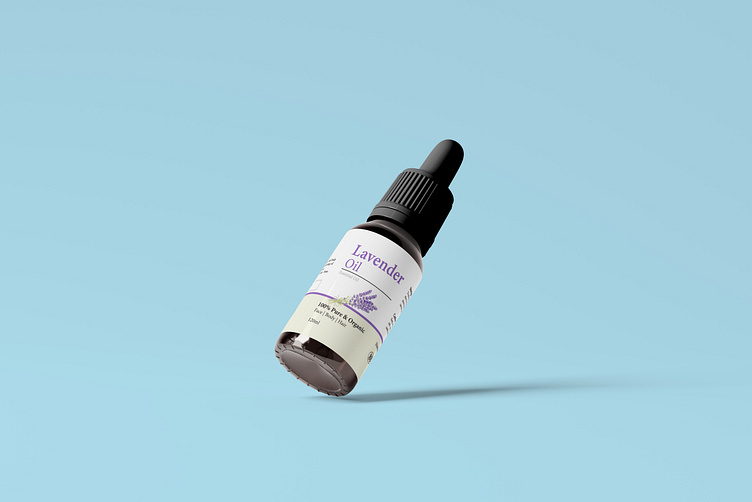
Dropper Bottle Label Design:
Precise Drops, Pure Essence: The dropper bottle label balances aesthetics and precision. The bottle itself—amber or cobalt blue—protects light-sensitive contents. The label features a serif font, evoking tradition and reliability. The brand logo, discreetly embossed, signifies quality. Beneath it, the product’s botanical origin (e.g., “Rosehip Oil”) is elegantly scripted. The dropper top—like a glass pipette—promises controlled dispensing. It’s a design that speaks of potency and care.
Leave me a message me on if it is working on you.
E-mail/Hangout : wapbulbul@gmail.com
visit our website www.finevector.com
