Data Logo Concepts
This visual exploration was completed for a company which builds custom software for clients who are struggling to make sense of the data they are collecting. The resulting product is designed to be accessible to non-tech people, and a core value is deep collaboration.
With this in mind, I wanted to imagine logo solutions which conveyed data and technology without feeling too cyberpunk (like The Matrix) or boring and corporate (like Microsoft). Let me know which concept you feel is the strongest!
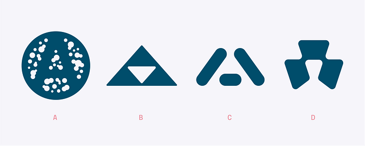
Concept A utilizes circles to represent data points, with the negative space revealing an A. This idea was inspired by the unique insight revealed by bullet holes on B-17 bombers in WWII. Initially, the impulse was to apply more armor to the areas with bullet holes. A statistician revealed that the armor needed to cover the areas not affected by bullet holes since the bombers in their study were all capable of making it back to their bases.
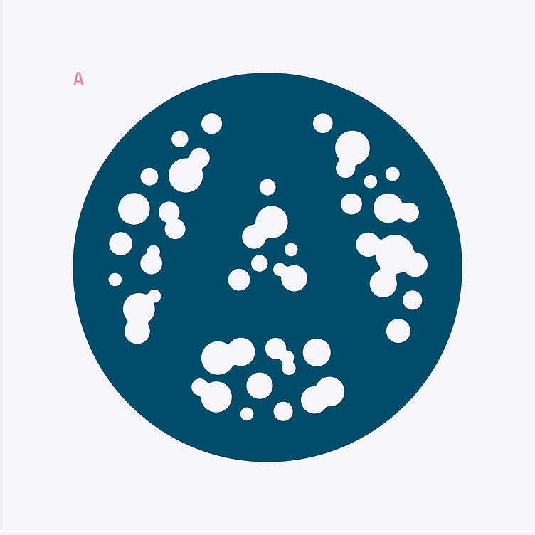
Concept B uses four triangles to construct a larger A shape. This composition was designed to show how the company (1 light triangle) may head in a different direction compared to larger organizations (3 dark triangles) who offer less customizable and more "off the shelf" solutions for their clients.
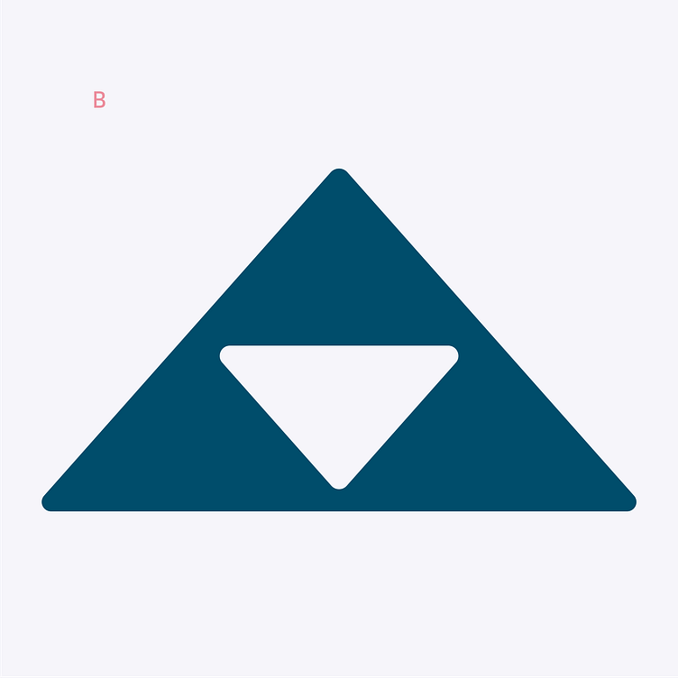
Concept C is a reductive stencil form which also feels like a slash and underscore from code. The letter A can be seen both in the positive and negative spaces.
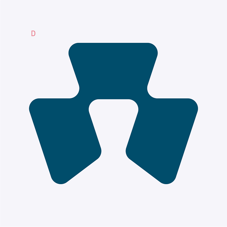
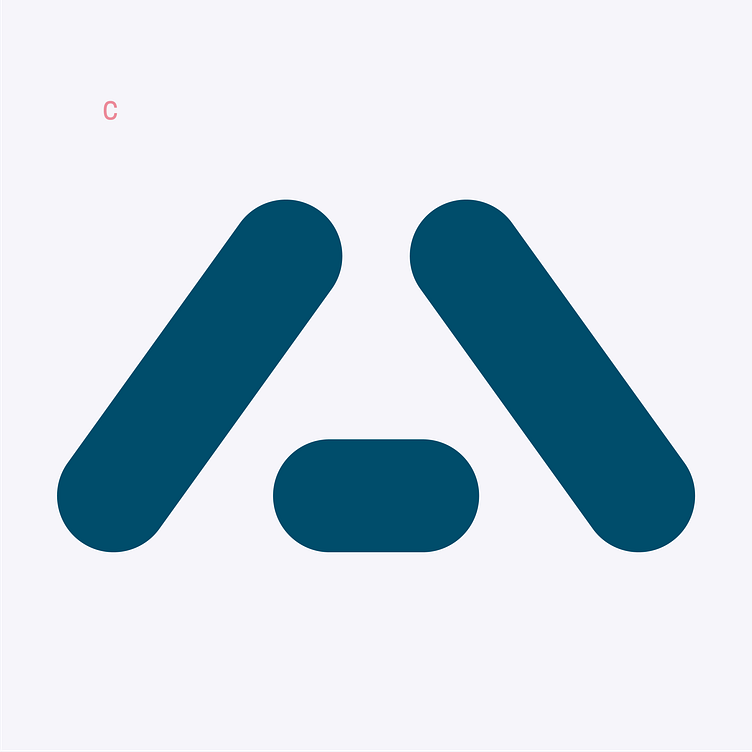
Concept D is constructed entirely out of an isolated and duplicated crossbar of a capital A. I felt that this option was energetic and conveyed pieces of information combining to reveal bigger ideas.