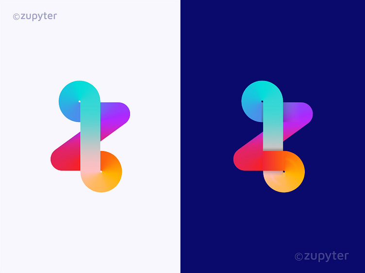
Z logo
I've designed two variations of the letter "Z" as part of Zupyter's branding. Both options are modern and minimalist, reflecting the brand’s forward-thinking approach.
Which one do you think suits Zupyter better – the left or the right?
More by Fahad Rohan View profile
Like
