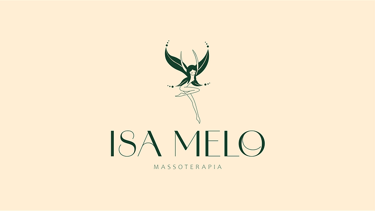
Isa Melo Massoterapia - Visual Identity
I had the pleasure of collaborating on the creation of Isa Melo's new brand’s visual identity, a massage therapist who recently opened her own practice.
The inspiration for the concept came from a kind compliment from one of her clients, who nicknamed her “fairy hands” due to her incredible massages. From there, the idea of using a fairy as the brand’s main symbol naturally emerged, representing the connection Isa creates with her clients.
The color choices were designed to evoke sensations aligned with Isa’s work. The green symbolizes both mental and physical well-being, and choosing a dark shade of it conveys confidence. The pink was added to soften the seriousness, bringing a light touch and representing the charisma and warm energy that are part of Isa’s personality.


