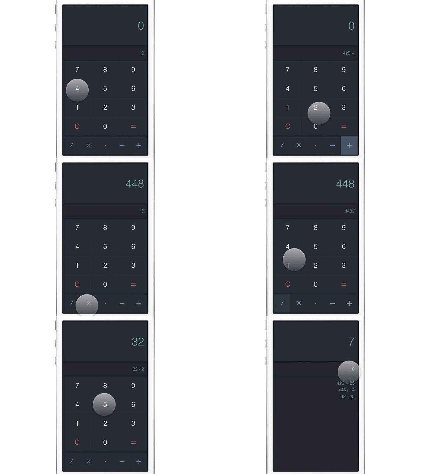
Daily UI 004 - Calculator (Animated)
Hey all,
This is the Daily UI for the calculator app, just trying out to see if there are some ways to improve on the ones we have now. A few things i thought was to use asymmetric distribution between the numbers and how 1 is used twice as much as 2, which is used twice as much as 3, etc. which is why i've changed the row order of the numbers. I also moved the operation functions to the bottom of the screen to make it easier to reach for both hands. I tried to simplify it as much as possible so removed functions which i found the majority of people dont use, also the clear button if there is something in the calculation field would be removed, if you click it again clears the whole screen. Clicking on the calculation field brings up the previous entries so you can see what you have done or redo an operation.
FramerJS included as well as the Sketch file for this, feel free to do what you want with them =]
http://share.framerjs.com/zcb0xrrkbhp8/
Comments always welcome, thanks for watching.
All the best,
Nick
