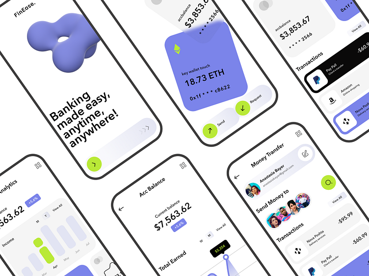
FinEase. - Mobile App Concept
Task
One of the key tasks was to ensure the ease of use of the application. Users should easily navigate the interface, regardless of the level of technical training. It is important that navigation is intuitive and that all functions are available in a minimum number of steps.
Solution
Using a minimalist design, large buttons and clear icons will help users easily find the functions they need. In addition, the navigation structure should be clear, which will allow you to quickly move between the main sections of the application.
More by Hanna Lysa View profile
Like
