WPBrigade
WPBrigade is a renowned WordPress Development Agency that specializes in outsourcing software development projects. They’re based in both the US and Pakistan, creating a fertile environment for Information Technology and Business Outsourcing.
Recognizing the need for a refreshed brand identity, they approached me in 2020, deciding it was time for a rebrand. Their goal was to create a logo that not only represented their expertise in WordPress but also conveyed their core values and vision through an iconic symbol.
Their previous logo, a simple wordmark, served its purpose but lacked the visual impact they deserved. Therefore, they required a design that combined an icon with their wordmark, aligning with their growth and future aspirations.
Research & Planning
In the research and planning phase, it became clear that WPBrigade's brand identity needed to embody its dedication to WordPress while reflecting its values of precision, reliability, and innovation. They wanted an iconic symbol that could stand alone yet harmonize with the wordmark.
The challenge was to encapsulate their brand's essence in a visual form. The exploration of various symbols led to the concept of incorporating elements that could convey a sense of leadership and expertise, much like an army brigade leading a mission.
Icon Development
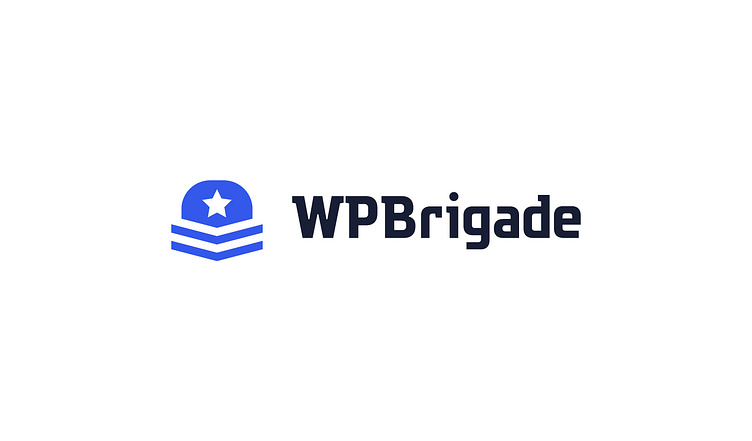
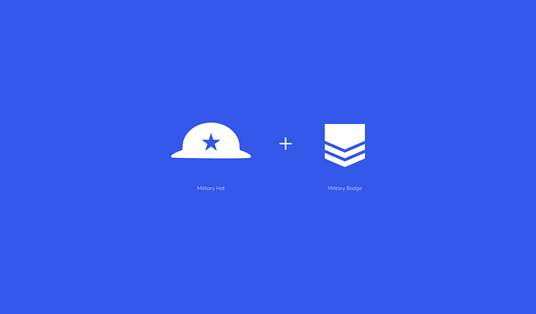
The company name, WP Brigade, naturally brought to mind military imagery. The word “brigade” is generally used as an army term, meaning a unit of the army.
Given that WP Brigade is a team of web developers and to reflect this, I designed a logo that featured a cap and incorporated a badge from an army uniform, symbolizing leadership and excellence. This combination created a visual metaphor for a brigade, leading the way in web development.
Logotype Development
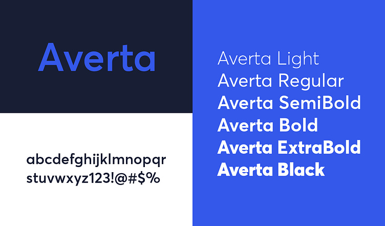
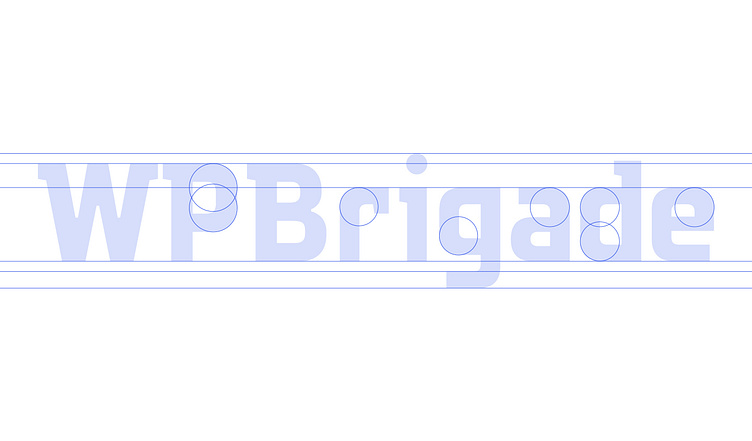
Every brand deserves a unique touch that sets it apart, so a custom typeface was essential for WPBrigade's new identity.
I selected a Slab Serif typeface because it complements the icon perfectly, adding a touch of strength and stability to the overall design. The custom typeface ensures that WP Brigade's brand identity is distinctive and notable, reinforcing its position as the leader in the web development industry.
Colour Palette
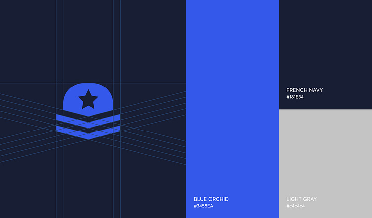
Initially, I considered military colors, but ultimately chose blue, inspired by WordPress’s branding and to emphasize WPBrigade's connection to WordPress.
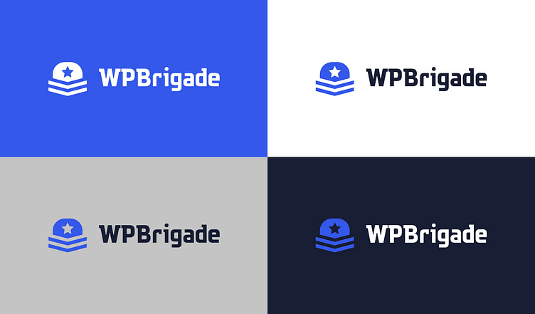
For projecting a modern, clean, and professional image, I chose blue and white for the color palette with WPBrigade's commitment to delivering clear and effective web solutions.
Blue Orchid symbolizes trust, professionalism, and expertise, whereas White signifies simplicity, clarity, and efficiency, aligning perfectly and making it a fitting choice for a web development company.