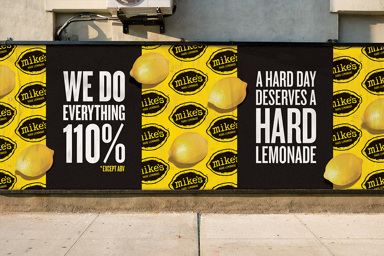
Mike's Hard Lemonade OOH refresh
Mike's Brand Refresh
To launch this new campaign, the VCCP team revamped Mike’s visual identity. We gave the Mike’s Hard Lemonade logo a contemporary graphic makeover and introduced a scaled-down version to enhance legibility on social. Additionally, we updated our typographic style and evolved our product photography. The 2024 campaign features product alongside our signature lemons, presenting them in a modern, realistic way with hard shadows on a grounded plane.
More by John Olson View profile
Like
