Bredband - Project Case
Task
The task to redesign Bredbånd involves modernizing its look and expanding content while ensuring user-friendliness and accessibility, ultimately aiming to enhance the user experience and stay competitive in the Danish broadband market.
Solution
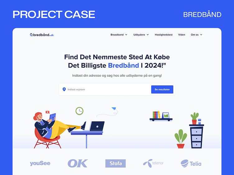
We modernized Bredbånd with a clean, user-friendly design, expanded content, and enhanced accessibility to improve the overall user experience and maintain competitiveness in the Danish broadband market. Our redesign ensures comprehensive comparisons, informative guides, and useful tools are easily accessible to users.
Visual design
The redesign features a clean, modern aesthetic, using the Proxima Nova font for a sleek and professional look. The light color palette creates an open, airy feel, while bright blue accents draw attention to key elements and interactive features.


