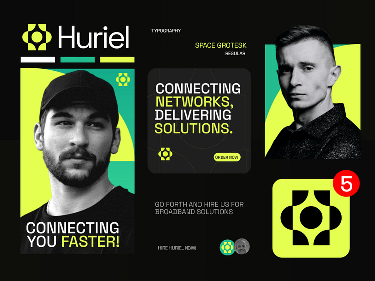
Huriel - Broadband / Wifi Logo & Branding design
Huriel - Visual identity design
LOGO CONCEPT :
This logo design is crafted to be both creative and minimal, featuring a prominent letter H that represents the first part of the brand name. The upward-facing icon signifies growth, At the center, the circle symbolizes a customer's head.This central element also represents the global connection of the Broadband.
COLOR PALETTE :
The color palette features a striking combination of neon green, black, and subtle turquoise tones. Neon green dominates the design, offering a vibrant and energetic presence that grabs attention immediately. It pairs well with black, which provides contrast and depth, creating a sleek and modern aesthetic.
Want me to help you by building
Brand Identity for your Business?
Reach me at :
E-mail - hello.shihabb@gmail.com
WhatsApp : https:/wa.me/+8801910238699
OCTOBER 18, 2024
