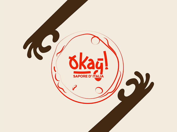
"OKay!" Italian pizza chain
Okay Italian pizza chain,
.
the logo is centered around custom typography that spells out "Okay" in a bold, modern font. The typeface is designed to evoke a sense of warmth and authenticity, with rounded, smooth edges that reflect the artisanal craftsmanship of traditional Italian pizza-making. The deep orange color of the typography is chosen to symbolize the rich, hearty flavors of Italian cuisine, especially the warmth of a perfectly baked pizza. This vibrant hue also conveys energy and excitement, making it an attractive choice for a fast-growing pizza chain. The light beige background provides a neutral, inviting canvas, reminiscent of fresh pizza dough, allowing the deep orange lettering to pop. This contrast makes the logo visually engaging and easy to recognize, helping it stand out in both storefronts and marketing materials. The tagline, "sapore d'Italia, (taste of Italy)" is placed below the logo and highlights the chain’s focus on delivering an authentic Italian experience. It appeals to customers seeking genuine Italian flavors, promising a dining experience that is both traditional and true to Italy’s culinary roots. The overall design reflects the chain’s commitment to quality, authenticity, and passion for Italian pizza. It merges contemporary aesthetics with a nod to Italy’s rich food culture, making Okay a strong visual and brand identity in the competitive pizza market.


