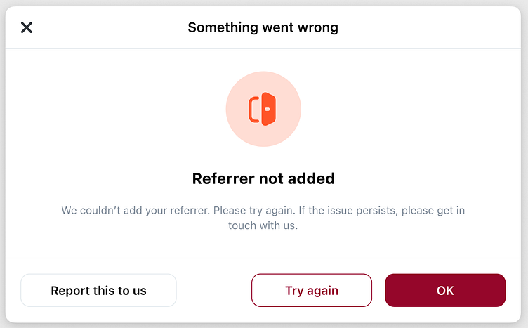
Error messages
Nothing beats a good error
Considered one of the trickiest strings to write, errors are one of my favorite UX elements to work on.
I do my best to keep them concise and informative. An error’s purpose is not just to inform the user that something is wrong, but also to provide reassurance and help, and make sure that we take the blame for the bug. Error messages should cause as little stress as possible, and their success depends on the collaboration between the UX writing team and the app developers.
More by Aleksandra Płaczek View profile
Like


