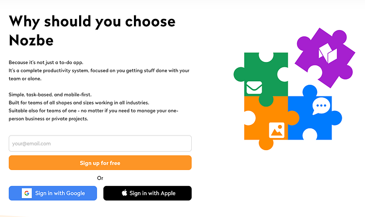
Nozbe.com/why
For Nozbe, I created copy for the "Why should you choose Nozbe" landing page:
Background
For over 13 years, Nozbe company offered a product called Nozbe, a productivity app for individual and team users. That app was later renamed to Nozbe Personal. In 2020, it launched a new app, Nozbe Teams, and became a 2-product company, with the intention to make Nozbe Teams the main product in the future.
Goals
As the company launched a new product, Nozbe Teams (later renamed to Nozbe), the business needed a landing page for both new users who wanted to learn more about the product, as well as old app’s users who could consider switching to the new app.
The landing page would answer the following questions:
- what is the new app all about?
- why is it beneficial to the user?
- why should the user consider switching from Nozbe Personal to Nozbe?
Process
I started working on the website by preparing a wireframe in Figma. Thanks to this, I knew how to strategically place the copy on the site and create the content flow:
Once I figured out the general flow of content for the page, I prepared a Dropbox Paper document. I prepared a draft of the copy there, and shared it with my team members, asking for their feedback and changes suggestions.
A few screenshots representing the document:
Final product
Once the copy’s been approved, the design and content were passed to Frontend for development. The page was published, and is still live to this day.


