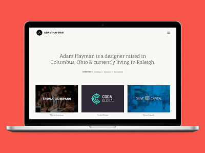
New Personal Site
Decided I was sick of all the fluff of my current portfolio site and wanted an excuse to try out Semplice (semplicelabs.com).
The focus of my redesign was making things easy on the users, giving them a platform to view my work neutrally, similar to a museum. Nothing but white walls, showing the work for what it is.
This also makes things easier on me, which means I'll be more likely to keep it updated with my latest projects.
All in all, I'm happy with it. There are still a few kinks to work out but Semplice is a great platform and I'm glad I used it.
More by Adam Hayman View profile
Like
