Micro space- Mobile version
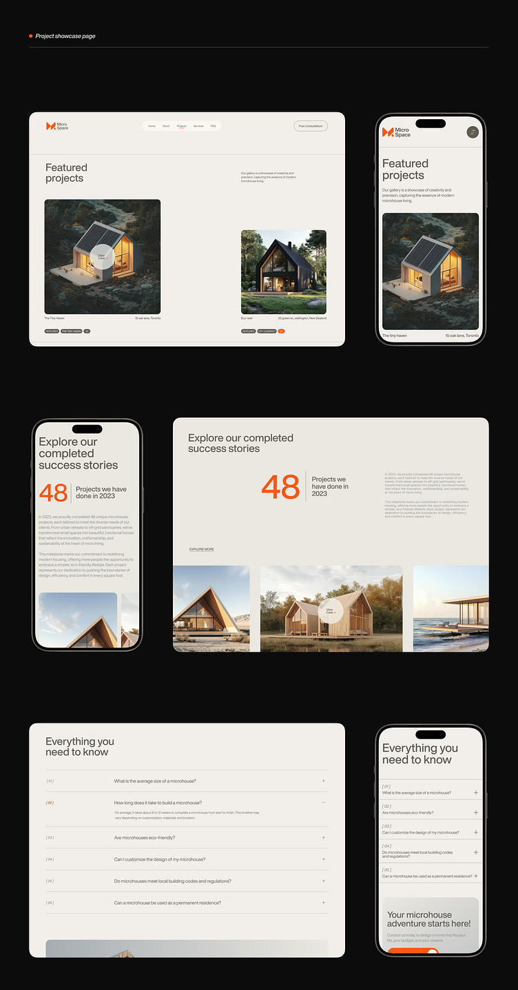
Micro Space - Mobile-Friendly Design
We’ve crafted a fully responsive, mobile-friendly version of our Micro Space case study website, ensuring a seamless user experience across all devices. The mobile design is clean, intuitive, and optimized for on-the-go browsing, allowing users to explore unique spaces effortlessly. Key features include simplified navigation, quick access to venue details, and streamlined contact forms for booking inquiries—all tailored to smaller screens without compromising on visual appeal.
Please check the full case study: Click here
This design not only enhances usability but also reflects the innovative and forward-thinking nature of Micro Space, offering users a smooth and engaging experience, whether on desktop or mobile.
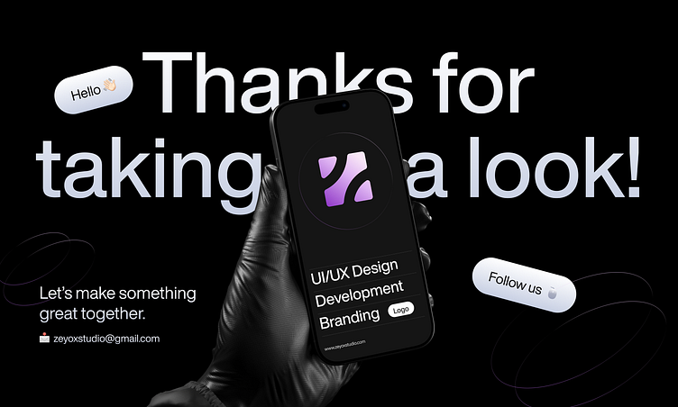
Do you have any design projects? Let's work together to create something fantastic.
Get in touch: zeyoxstudio@gmail.com
Let's connect: