Line logo
Category - Line Logos
Services - Branding
Author - Rafiqul Islam
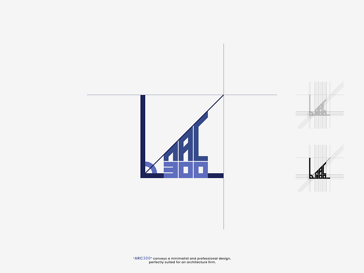
"ARC300 conveys a minimalist and professional design, perfectly suited for an architecture firm. The use of sharp lines, geometric shapes, and angles reflects precision, a key aspect of architectural design. The incorporation of a right angle and lines in the logo suggests technical expertise and meticulous planning, qualities central to architecture.
The ARC lettering seems to blend smoothly into the structure of the logo, maintaining a balance between form and function, just like great architecture.
The 300 in the name suggests modernity and exactness, giving it a numeric identity that stands out.
The color palette of deep blues adds a sense of trust and reliability, while the angular shapes evoke innovation and forward-thinking. The overall design hints at a firm that values both creativity and structural integrity, making it a strong visual identity for an architectural practice."
__________
If you're ready to level up your logo design & brand identity game, reach out to
Email: rafiq8772@gmail.com
Whatsapp: +8801675679549
#ARC300; #GeometricDesign; #SharpLines; #ModernArchitecture; #ArchitecturalPrecision; #DesignInnovation; #MinimalistArchitecture; #ArchitecturalInspiration; #GeometryInDesign; #CreativeStructures;
