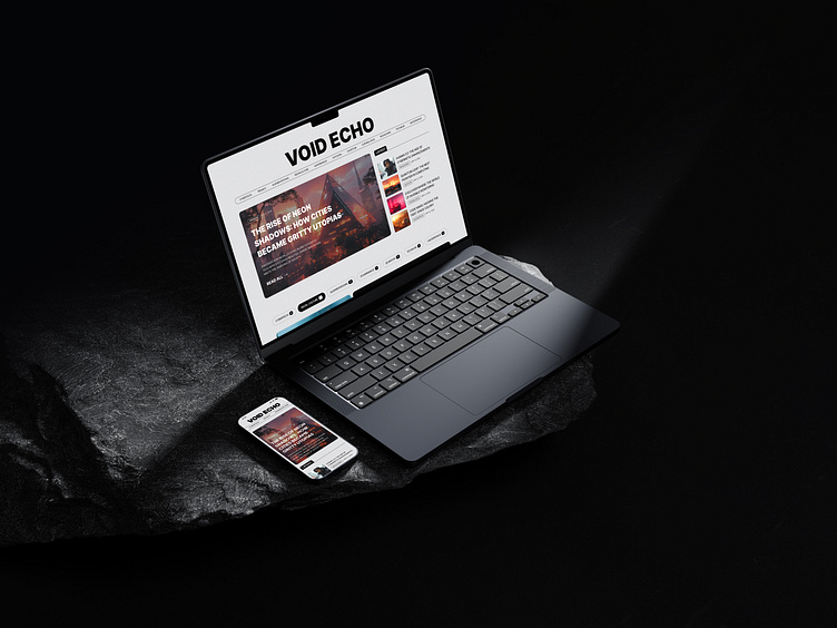
Void_Echo
News for the future
For Void Echo, I developed a minimal UI designed to ease cognitive load and let visuals take center stage. By reducing the number of on-screen elements, the design emphasizes a clean, distraction-free environment where imagery shines. The monotone styling further enhances the focus on visuals, while subtle textures were introduced to give the site a slight retro, tactile feel. This approach creates a balance between futuristic aesthetics and a grounded experience. Through branding, art direction, web design, and Framer development, Void Echo offers a visually immersive yet highly usable interface.
More by Alex Karpodinis View profile
Like


