Branding: Keiko – A Symphony of Japanese Cuisine
Keiko – A Symphony of Japanese Cuisine
"Keiko" (which means "Lucky child" or "Blessed child") brings the essence of Japanese culture to life, blending tradition and modernity into a stunning culinary and visual experience.
Inspiration and Concept
The idea was to create a brand identity that represents the elegance, minimalism, and harmony found in Japanese culture.
The color palette was carefully chosen to reflect passion and sophistication: vibrant red symbolizes energy and life, while deep black adds a touch of luxury.
Logo Design: The Heart of the Brand
1. Inspiration
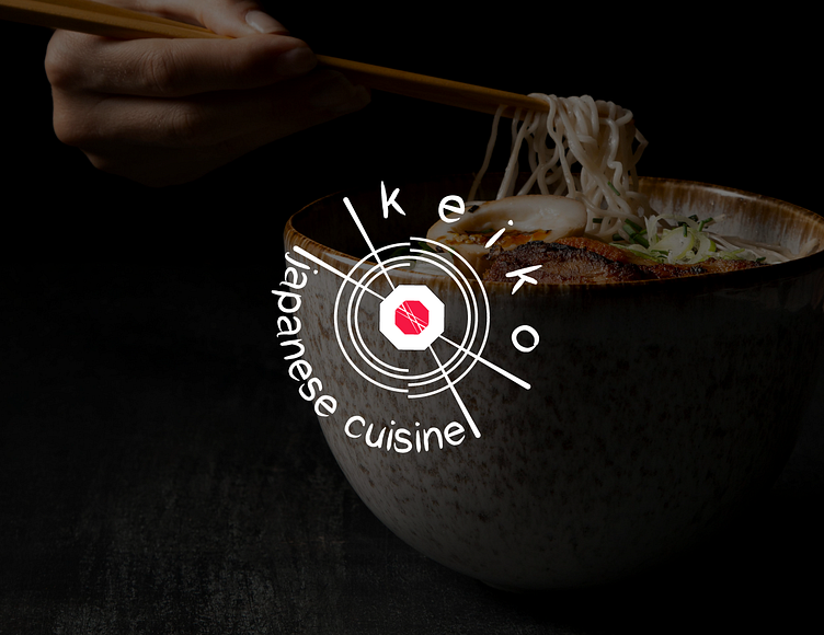
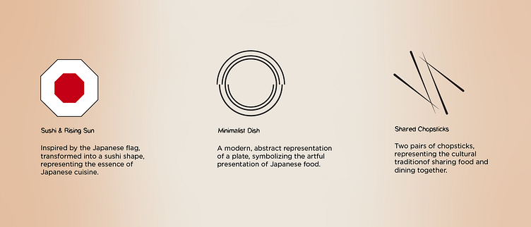
The logo design is inspired by the delicate art of Japanese cuisine. The concentric circle pattern represents balance and precision, reflecting the dedication and care that characterize traditional Japanese cooking.
2. Elements
The logo design combines multiple elements inspired by Japanese culinary art:
A sushi roll, symbolizing the core of Japanese cuisine.
Chopsticks, representing the dining experience.
A plate or noodles, emphasizing the presentation and variety of dishes offered.
Together, these elements create a harmonious visual that connects tradition with a modern aesthetic.
3. Execution
The logo is modern yet rooted in tradition, ensuring it stands out in both digital and physical applications, from storefronts to packaging.
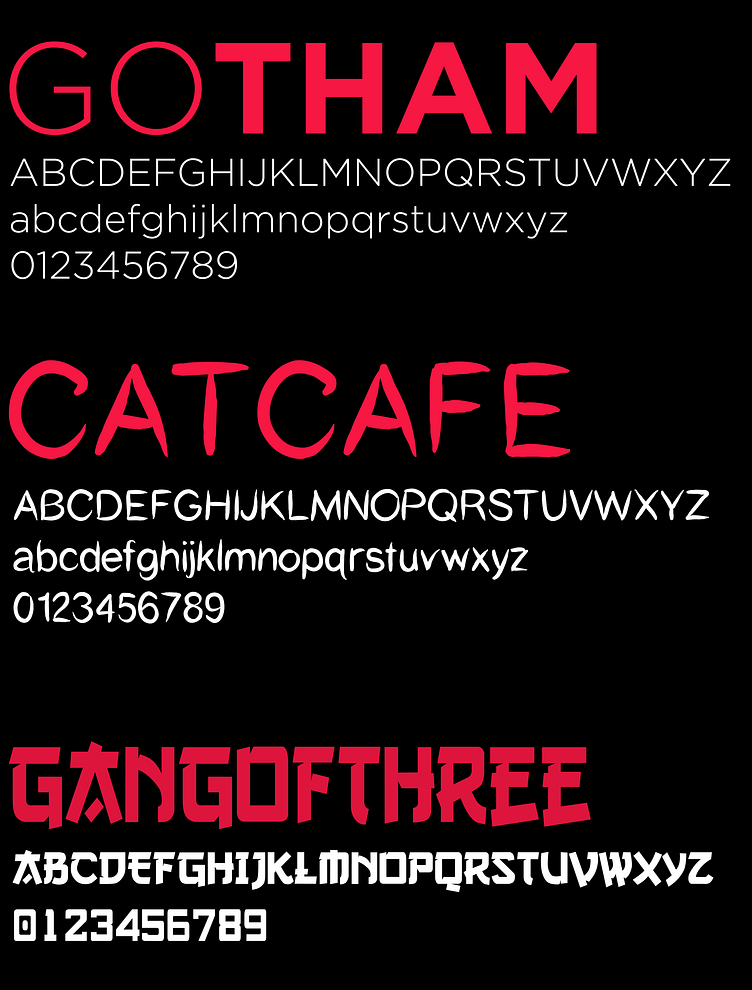
3. Typography
Typography choices reinforce the brand's character: Gotham: Clean and modern, offering contrast and readability. CatCafe Medium: A playful yet elegant font used for titles to make the brand approachable.
GangofThree: Adds a decorative touch reminiscent of traditional Japanese art.
Together, these fonts create a symphony of modern sophistication and cultural homage.
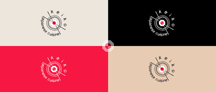
4. Color Palette
Keiko's color palette is designed to convey elegance and balance. A refined selection of tones creates a seamless harmony between tradition and modernity, ensuring a timeless and visually appealing brand identity.

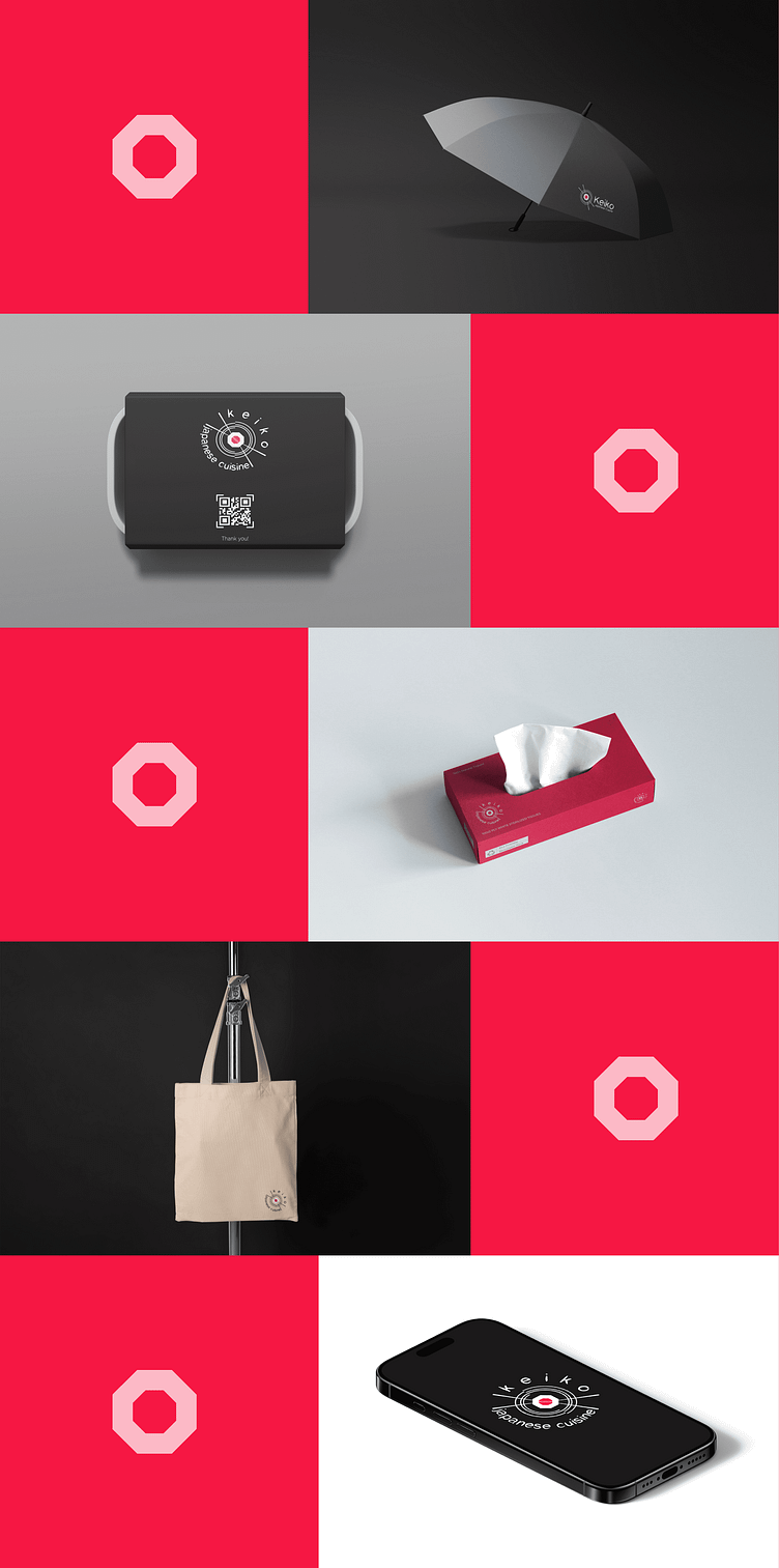
5. Visual Assets: A Cohesive Experience
Mockups were developed to showcase how "Keiko" translates across different touchpoints.
Every element of this project tells a story of balance and refinement, bringing Japanese culture to a global audience. From the first glance to the smallest details, “Keiko” is a brand designed to resonate visually, emotionally, and gastronomically.
Let’s Collaborate!
If you are looking for a creative and tailored brand identity like "Keiko" or need assistance in designing a unique and impactful project for your business, feel free to get in touch. Let's bring your vision to life together!
I’m excited to collaborate and create something extraordinary for you!
Contact me via:
📧 Email: kenankamberis2@gmail.com
