Travel Booking Website Design by baseTOP - Celestial Suites
Project Overview
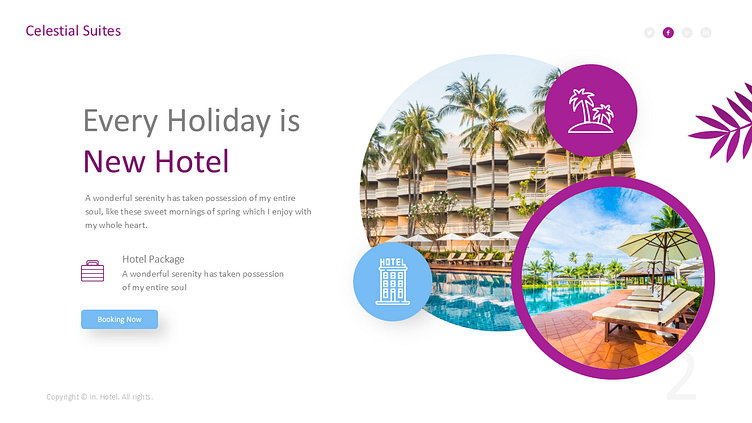
baseTOP designed a travel booking website to streamline hotel searches and bookings. We focused on key sections, including the homepage, landing page, hotel detail page, and payment integration. The goal was to create a modern, user-friendly platform that works seamlessly on all devices. Our design aimed to enhance user experience, ensuring ease and efficiency in the booking process.
Mock Up View
Output
We developed a responsive and visually appealing website that functions smoothly on desktops, tablets, and mobile devices. The homepage provides intuitive navigation, while the hotel detail page offers clear, informative content. The landing page is optimized for engagement, and the payment page ensures secure, hassle-free transactions. Every element was designed to enhance usability and appeal.
Full Overview
Color Usage
The color scheme features soothing shades of blue and teal to convey trust and calmness, which is ideal for a travel site. Vibrant accents like orange and yellow were used for CTAs, drawing user attention. Neutral greys and whites kept the overall design clean and focused. This balanced palette creates a professional yet inviting user experience.


