Course Detail page for an LMS 📚
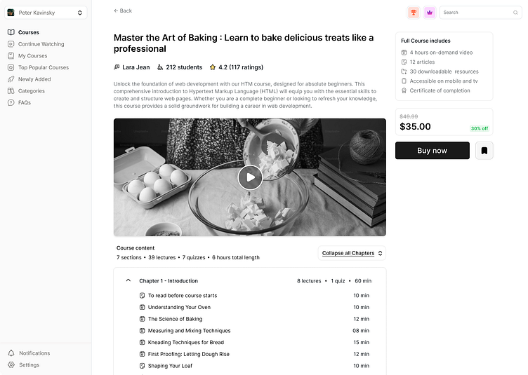
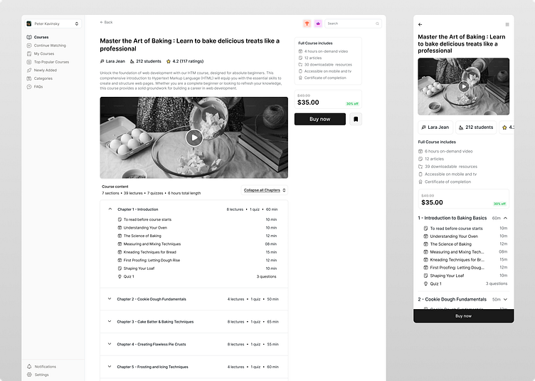
Been busy designing for an LMS - Desktop + Mobile 🖍️
Here are the key features that I believe enhance the user experience and engagement:
Social Proof: By showcasing the number of students enrolled alongside glowing reviews, I aimed to build trust and credibility. It’s important for potential learners to feel confident in their choice, and seeing that others have benefited can make all the difference!
Mobile-Friendly Learning: I wanted to make learning as accessible as possible, so I included a clear course summary and downloadable resources. This way, users can engage with the content wherever they are, making learning convenient and flexible.
Streamlined Navigation: The collapsible chapters with time estimates and quiz details are designed to help learners easily understand what to expect. I believe this organization makes it easier for users to navigate and feel empowered to complete the course.
Clear CTA: The prominent "Buy Now" button encourages immediate action. I also incorporated subtle hints of a leaderboard, featuring a trophy and crown, to add a fun, competitive element that motivates learners to excel and make their mark.
