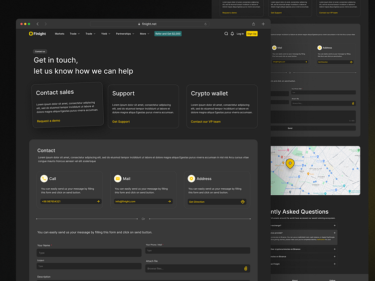
Finight Website - Cotact
Finight Contact Page
Connecting Users with Style and Functionality
The dark-themed UI of Finight’s contact page emphasizes elegance and clarity, making the communication process seamless and visually appealing. Every detail, from typography to button placement, has been carefully considered to enhance user interaction.
Designing web pages requires a balance between aesthetics and functionality, especially when considering the user journey across different sections. As a product designer, it’s crucial to ensure that each page, particularly high-traffic ones like the contact page, is intuitive and user-friendly.
This involves clear navigation, a visually harmonious layout, and a design that reinforces the brand’s identity. For a product like Finight, where the dark theme adds sophistication, every element must serve a purpose—whether it's guiding users to the right action or creating a consistent experience that aligns with the overall product vision.

