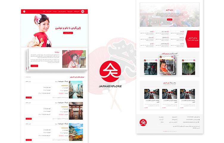
JapanExplore website
For the “Japan Explore” project, both design and implementation were carried out to ensure that users can easily search and plan their travel journeys. This project was specifically crafted for the renowned tourism team, Japan Explore, featuring a modern and user-friendly design. The primary colors, red and white, reminiscent of Japan’s national flag, not only reflect the cultural identity of the country but also attract attention and create a sense of belonging to the destination.
In various phases of design, Figma was utilized to create interactive prototypes and optimize user experience. The design is structured in such a way that users can easily find the necessary information, enabling them to enroll in tours and plan their travel itineraries with ease.
This project was designed and implemented by my team and me at the Phoenix Creative Agency.
Website address:https://japanexplore.tours/


