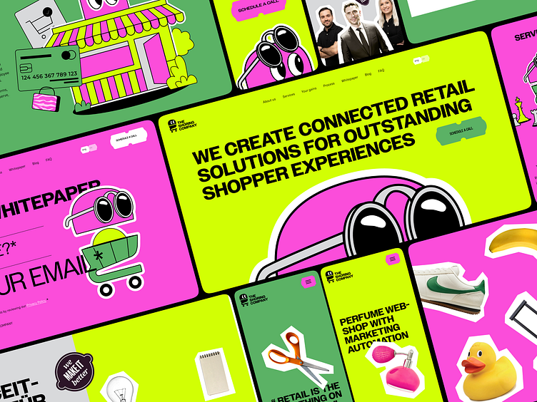
Shoring - Landing page design for the retail company
Bold, Engaging & Built to Stand Out
The Shoring series continues! This time we’re spotlighting their website design with some slick desktop and mobile screens.
Why is this important? Because consistency is key—especially regarding the brand’s website. It’s the digital front door to Shoring, so it has to radiate its bold personality and business savvy.
Here’s how we approached it:
From structure to copywriting, we crafted a user-first narrative with thoughtful interactions and animations (more on this week) to keep things engaging.
The design? It screams Shoring with its standout aesthetics and powerful messaging, making sure Shoring doesn’t just blend in but dominates the market.
We went with a one-page website that packs a punch—just like a business card, but digital! It’s clean, concise, and captivating, perfect for grabbing attention right away (most clients come through networking, after all).
Built on a CMS to make content editing and updates as easy as pie.
Let us know what you think of this digital magnet! 👀✨
Kudos to our incredible team:
Andrii Sokolov — Creative Director
Anastasiia Kalyta — Project Manager
Yaroslav Khaletskyi — Sales Manager
Yehor Mushka - Development
Olena Kovalenko — UI Design
Oles Pasychnik — Animation
________________________________
Do you want to win the competition game?
Let's set your brand in motion: collab@theqream.com
