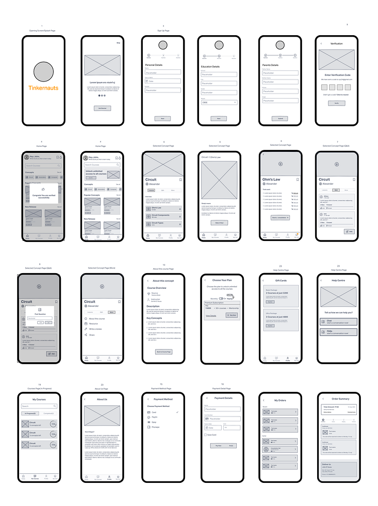
Lo-Fi Wireframes for an Intuitive EdTech App MVP
Before moving on to branding and high-fidelity design, the first key step was creating low-fidelity wireframes. These wireframes outlined the structure and user flow for the MVP of an ed-tech app, focusing on simplicity and intuitive navigation for young learners.
Here’s a sneak peek at some of the lo-fi wireframes from the complete app. These early iterations helped shape the app’s overall layout and functionality, allowing us to refine ideas before moving into the next design phase.
If you enjoyed it, don’t forget to hit the “L” button and follow me for more! ✌️ Got any feedback or collaboration ideas?
-----------------------------------------
Feel free to reach out at dikshagoel2005@gmail.com.
Let’s create something awesome together!
More by Diksha goel | UI/UX Designer View profile
Like
