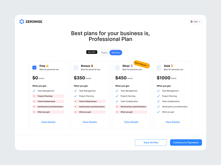
Pricing Plans Screen
Here's a sleek and organized pricing plan screen for Zerowise! 🧩 The goal was to create a straightforward and user-friendly interface where users can easily compare subscription options, from the free tier to premium packages. Each plan is broken down with clear features, making it easy to understand the benefits of upgrading.
🔹 Highlights:
- Simple, clean layout to enhance readability.
- Visual hierarchy to guide users toward the Most Popular plan.
- Subtle toggle for monthly or yearly billing options to encourage savings.
What do you think of this pricing design? Would you optimize it differently? Let us know in the comments!
Find us on:
🏀 https://dribbble.com/MagikaStudio
🎨 https://layers.to/magikastudio
🔥 https://flames.design/magikastudio
📷 https://www.instagram.com/magika.studio/
Have an amazing project? Send to our email:

