Fresh Food Delivery App – Your Favorite Meals, Just a Tap Away
Description
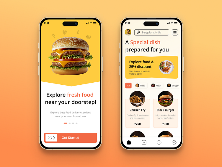
This vibrant and inviting mobile app design showcases an intuitive and engaging food delivery experience. The playful yet clean interface is built to attract users with its eye-catching visuals and user-friendly features, making it easy to explore and order fresh food from local eateries.
Bright & Appetizing Visuals: The hero section on the landing screen greets users with an appetizing burger image against a vibrant yellow background, immediately capturing their attention and setting the tone for a fresh and fun user journey. The colors evoke a sense of energy and excitement, enticing users to explore the app further.
Engaging Call-to-Action: The "Explore fresh food near your doorstep!" message, combined with the prominent "Get Started" button, encourages immediate action. The soft rounded buttons and sliders ensure a friendly, accessible interaction, perfect for users who want to dive right into exploring menu options.
User-Centric Recommendations: On the second screen, users are welcomed with a personalized message — “A Special dish prepared for you” — enhancing the feeling of customized service. The special 25% discount banner is neatly placed, ensuring visibility without overwhelming the user interface.
Seamless Navigation: A well-structured filter system (All, Pizza, Meat, Burger) allows users to quickly find their favorite dishes. The use of clear icons and easy-to-read typography further simplifies the browsing experience.
Dish Showcase: Below the category filters, individual dishes like "Chicken Fry" and "Stack Burger" are showcased with mouth-watering visuals, descriptions, and pricing. Each dish card is well-spaced, ensuring users can easily compare options without feeling overwhelmed.
Location Personalization: The top bar displays the user’s current location (Bengaluru, India), reinforcing the local, personalized nature of the app. This feature reassures users that they can access food tailored to their exact location.
Warm Color Palette: The consistent use of warm colors like orange, yellow, and red evokes hunger and excitement, perfectly aligned with the food industry. This palette also ensures a cheerful and welcoming user experience.
Intuitive Bottom Navigation: The clean and simple bottom navigation bar offers essential functions like home, orders, search, and settings, making the app intuitive for both new and returning users. Its compact and user-friendly design ensures easy access to core features without cluttering the screen.
Responsive Layout: The layout is built with a mobile-first approach, ensuring seamless use across different screen sizes. It provides a smooth experience whether users are scrolling through the app or selecting items for their cart.
Discount & Urgency Display: The inclusion of the discount banner with a countdown timer adds a sense of urgency, motivating users to complete their orders quickly to take advantage of limited-time deals.
