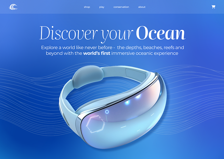
OceanVR Desktop UI Experience
Diving into the Ocean with OceanVR
Goal: To create a visually immersive and engaging website for OceanVR, a fictional client offering a VR headset that transports users into the depths of the ocean. The website’s purpose was to showcase the headset’s unique features while providing an experience that reflects the breathtaking beauty and mystery of underwater exploration.
As the lead designer, I was responsible for building a captivating user experience that guides visitors through the OceanVR journey. This involved concept development, visual design, and interactive features that highlight the VR headset’s capabilities. My approach was to create a cohesive design that uses high-quality ocean imagery, gradient backgrounds, and interactive elements to mirror the sensation of diving into the ocean. From the homepage to the purchase page, each section was designed to spark curiosity, highlight product details, and encourage users to explore further.
Design Strategy
The design strategy for OceanVR’s website focuses on immersing users in the oceanic theme. Using a gradient background that transitions from light blue to deep navy, I aimed to create a sense of depth and progression as users scroll through the page. Each section corresponds to a different ocean environment, with imagery and colors tailored to convey the beauty of coral reefs, open waters, and the deep sea. Interactive elements, such as hover effects and parallax scrolling, enhance engagement by making users feel as though they are part of the underwater experience. This approach not only highlights the VR headset’s unique selling points but also emphasizes OceanVR’s commitment to delivering a memorable virtual adventure.
Colour & Typography
The colour scheme for the OceanVR website reflects the natural hues of the ocean. Light blues, teals, and rich navies transition smoothly across the site, evoking the feeling of descending into the ocean. For typography, I selected a clean, modern yet rich font to maintain readability and complement the visual elements. The headings feature a serif font Literata that conveys elegance and curiosity, while the body text is a sans-serif font Montserrat that ensures clarity and ease of reading. Together, these choices create a sophisticated and cohesive design that aligns with OceanVR’s branding and enhances the user experience.
Interactive Features
To highlight the immersive capabilities of the OceanVR headset, I incorporated various interactive features that engage users throughout the website. Each environment — Coral Reefs, Shark Waters, and The Whale’s World — is introduced through high-quality visuals and accompanied by hover animations that bring the ocean scenes to life. The product comparison page includes animated call-to-action buttons and hover effects to guide users through the buying process. By blending these elements with smooth transitions and subtle animations, I was able to create a dynamic experience that mirrors the VR journey.
Reflection
The OceanVR project was an exciting opportunity to design a website that merges visual storytelling with user-centered design. This project allowed me to explore creative solutions for presenting an immersive product in a way that is both engaging and intuitive. I focused on aligning the website’s visuals and interactive elements with the essence of the VR experience, ensuring that users feel connected to the ocean adventure from the first click. This project showcases my ability to combine strategic design choices with technical skills to deliver an impactful digital experience.


