Dynamic Branding in NeoBrutalism: A Bold Identity for a Startup
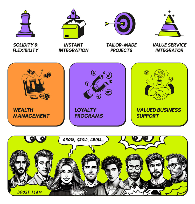
Meet Techgroove, a vibrant and dynamic startup from Italy transforming value and loyalty programs into real, measurable engagement.
THE CHALLENGE: BREAKING AWAY FROM THE BORING
Techgroove had a bold vision: to break the mold and stand out in an industry dominated by outdated, old-school visuals. They weren’t looking for just another cookie-cutter tech brand—they wanted something bold, fresh, and full of energy.
After falling in love with the neobrutalism style on my website, they reached out to have me design their brand and website. The goal? A brand that felt reliable and down-to-earth, but still young, fun, and dynamic. Plus, they wanted to ditch the usual team photos and go for a comic book hero theme instead. With all that in mind, we got to create a brand that truly reflects who they are.
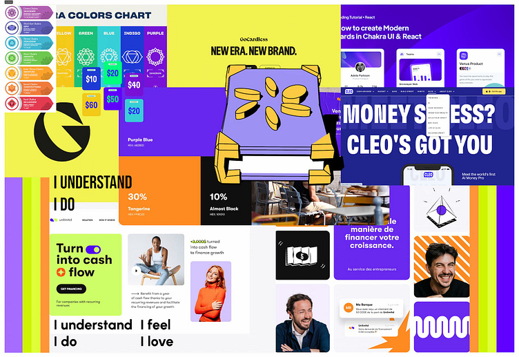
EYE-CATCHING MOODBOARD
For the initial moodboard, I focused on finding brands that felt fresh, strong, and modern — something that immediately grabs your attention and stands out. I wanted to capture the energy that leaps off the screen, a mood that encourages you to be bold, vibrant, and feel understood.
An interesting input from the Techgroove team was their love for the color purple, inspired by the Sahasrara chakra. Located at the top of the head, it symbolizes the connection to the higher self and the divine, which added a deeper, spiritual element to the moodboard.
VISUAL DIRECTIONS: HOW BOLD DO WE GO
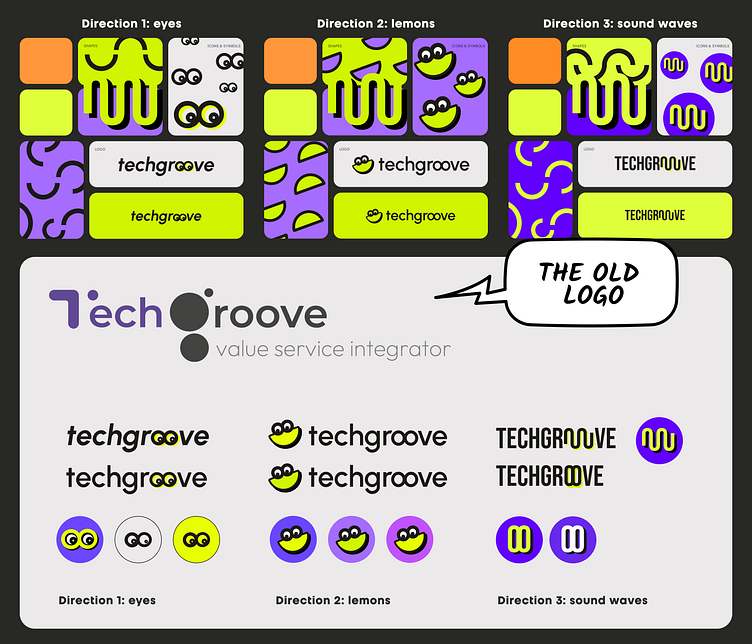
After presenting the moodboard and discussing it with the team, I dove into visual explorations. Normally, I focus on two directions, but this time I explored three. I wasn’t sure how bold and playful Techgroove wanted to be or if they’d prefer something more serious.
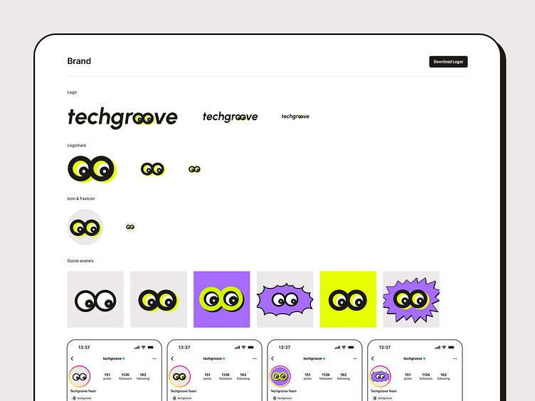
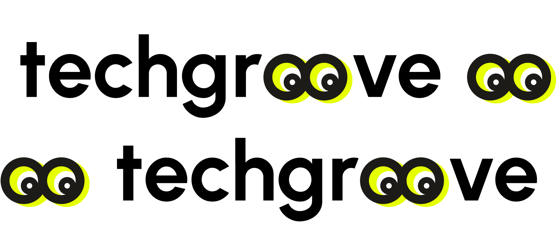
The first direction was a playful twist on a text logo, replacing the “oo” in Techgroove with eyes that could later serve as a logomark for social media and the website. The second was even more playful, featuring a lemon-shaped logomark with eyes. The third direction leaned more classic and safe, inspired by sound waves, which tied back to their name.
MORE PASSION, MORE ENERGY, MORE ITALIC
Once we all agreed on the first direction, which the team loved, I moved on to the typography and color scheme. Initially, I was unsure about using italics, but after experimenting—especially with the hero section and logo—it became clear that italics gave the typography the energy and movement it needed. It felt dynamic, like it was pushing forward, just like the Techgroove team.
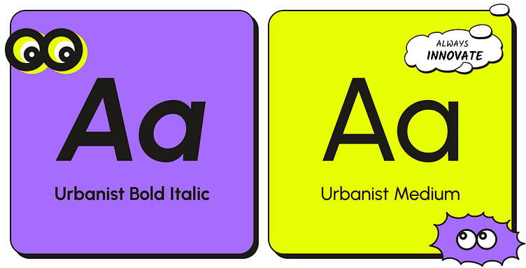
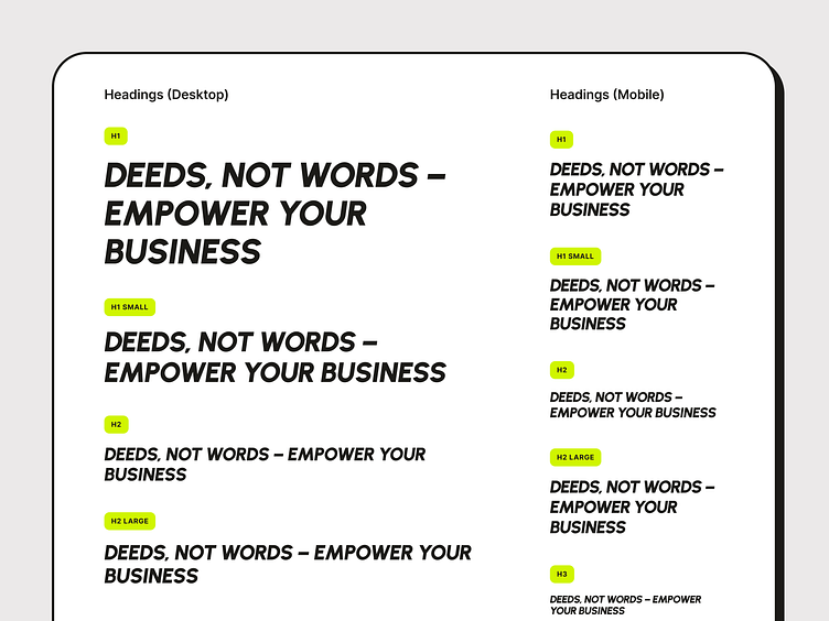
That’s how Urbanist Bold Italic became the core font for the brand and website titles. To amp up the strength and boldness, we went with Urbanist Bold Italic in all caps for the titles, adding even more punch and aligning perfectly with the team’s energetic vibe.
COLORS: NEOBRUTALIST & BOLD
A challenge with neobrutalism is the risk of overusing bold colors, which can overwhelm the design. For Techgroove, I found a way to keep the neobrutalist energy by limiting the color palette for better balance. Fewer accents make each one more impactful.
I went with a minimalist palette but with bold, attention-grabbing colors that pop in all the right places. To balance these, I used plenty of white space, simple black, and light grey.
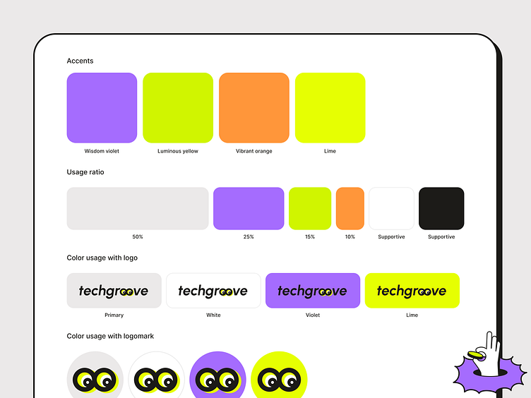
The visuals—like the logomark, illustrations and icons—are intentionally loud and saturated with these bold accents. But when using accent colors in the background, I paired them with simple black illustrations to keep things balanced.
By keeping the palette minimalistic and balancing the usage, I stayed true to the neobrutalist style without overloading the design.
SUMMARY
This case study highlighted the journey of creating a bold, dynamic brand identity for Techgroove using a neobrutalist style. From a minimalist yet vibrant color palette to playful, energetic visuals, we built a brand that truly reflects their vision and sets them apart in their industry.
The new branding is now live on their website, and the team is thrilled with how it turned out, aligning perfectly with their energetic, innovative spirit.
In my next case study, I’ll dive into how we approached the website design and how it complements the new branding.
Services provided:
· Branding
· Website Design
· Illustrations, Icons, Other Graphics
· Web Development (Webflow)
📩 Reach out if you need help with your branding or website design.
--------
Follow me on my 📸 personal or 👩💻 professional Instagram.
Or visit my website to learn more about me.