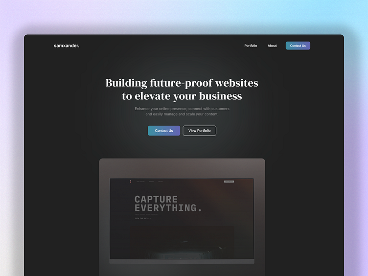
Web Developer Landing Page Concept
Simple Approach
Here's a modern, minimalist website landing page design, which highlights a clear concise proposal, CTAs to progress or learn more and a large visual stimulus. A simple approach like this can be useful when you don't want to overwhelm the user and it promotes a sense of trust when done right.
Tip: Use a secondary CTA as an alternate path for the user in the case that they aren't ready to commit to the primary CTA.
Clear Benefits
A clear section of what the business offers is crucial to help the user understand whether this is a good fit for them. There is a limited time to get this information across. To achieve this here, we use clear icons (which act as a visual hook) and short text which is perfectly designed to show the value in as few words as possible.


