Uber Rebrand
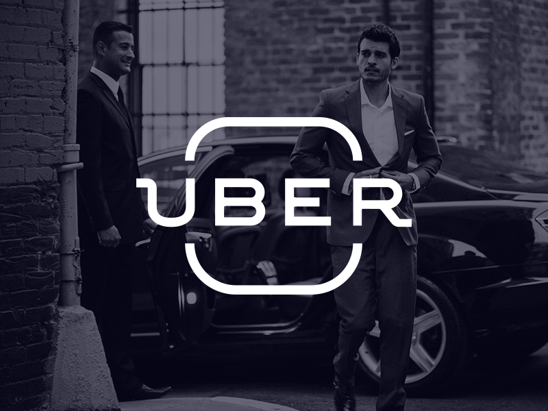


First of all, Uber recently got a radically new look.
As an user of Uber, it didn't make me visually have the same experience as before. I couldn't stay away.
That's why I come in front of you with my vision of an Uber rebrand.
What I decided is to continue with the well-known Uber type (while making it stronger + reducing the letter spacing) and give it a more personal/human feel. I managed to do that by adding a context to the main logo:
Uber makes it all easier.
- You can BE YOU. You can BE a DRIVER.
You have to get to that really important meeting?
- You will BE ON TIME. Uber will BE THERE.
This is done by having an app icon-looking shape which isolated letters BE, making it possible to read it as a verb in a slogan.
What do you think?
Press the 'L' button to show some love!