DUI #3: Landing Page
Daily UI Landing Page
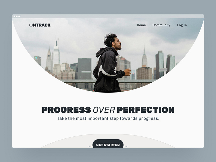
Landing page for OnTrack, a fitness platform that helps you take the most important step towards progress: getting started. Get on track with the help of an active and supportive community.
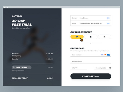
The copy for this page emphasizes how easy this platform makes it to get on track and ends with a CTA to sign up for a 30-day free trial, encouraging user sign ups and connects the landing page with the checkout page as the next step for new users.
To break from the traditional square layout, I incorporated the shape of the OnTrack logo into layout as much as possible. I loved the idea of putting the "get started" button directly on a track as a play on words and answer to the tagline. Using wordplay and placement to capture visitors attention.
The track also naturally leads your eyes down the rest of the page and acts as a divider between the hero, body, and footer.
Using the logo motif for images was also clutch and gives the page a distinctive, modern look while still emphasizing fitness.


