CNTK - Law Firm Logo
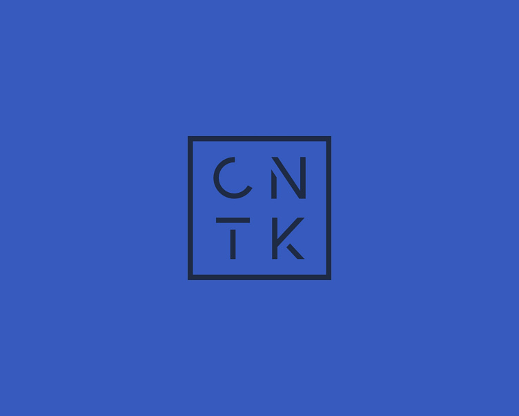
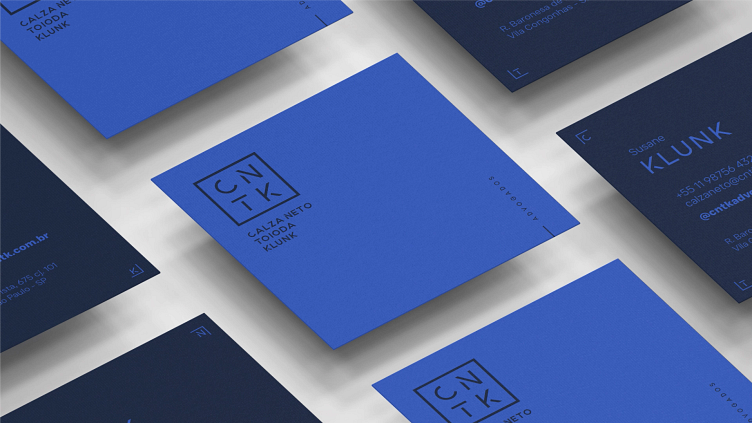
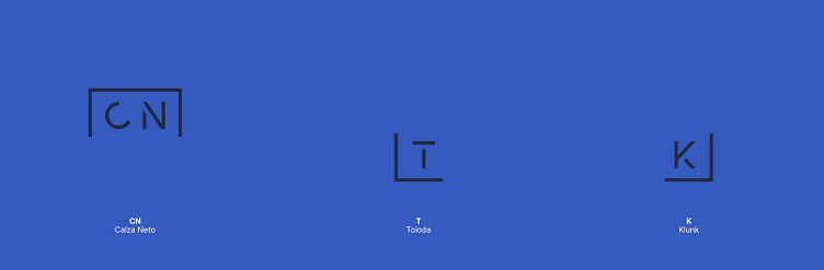
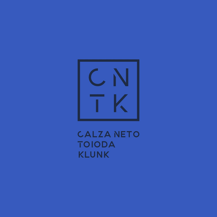
Designing this logo presented some interesting challenges. As is often the case with law firms, the partners were drawn to a logo featuring their initials, specifically within a square format. They envisioned a clean, minimal design with a color palette that was professional but not overly conservative, striking a balance between vibrancy and starkness.
I opted for a geometric sans-serif typeface and carefully refined the letterforms. The geometric structure provides a sense of stability and order, while the subtle adjustments to the letters add a touch of personality, keeping the design sleek and modern and aligning with their desire for a contemporary aesthetic.
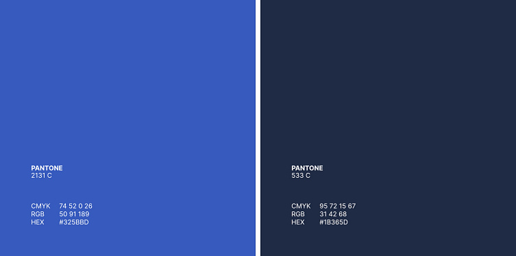
For the color palette, I selected a combination of two blues – a deep, rich navy for a sense of authority and trustworthiness, and a slightly brighter, more vibrant blue to inject a touch of dynamism and approachability.
For the general-purpose typeface, I chose Inter. Its clean lines and excellent readability make it a perfect choice for legal documents, website content, and other materials where clarity is paramount.