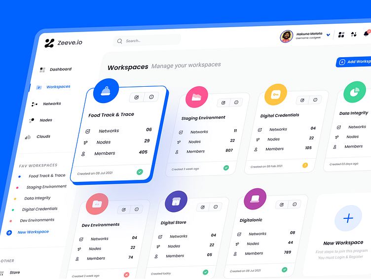
Revamped Workspace Management for Zeeve.io
Client : Zeeve (Blockchain Deployment and Management Platform)
Date : January 2021
💪Challenges:
👉Zeeve.io's existing workspace management screen was cluttered and difficult to navigate.
👉Users needed a way to easily view and manage their workspaces, including networks, nodes, members, and favorite workspaces.
🔥Solutions:
⭐Designed a clean and intuitive UI that makes it easy for users to find the information they need.
⭐Implemented a clear hierarchy with sections for dashboards, workspaces, networks, clouds, nodes, members, favorite workspaces, and dev environments.
⭐Used concise labels and icons to make the interface easy to scan.
⭐Incorporated a "+" button to allow users to easily add new workspaces.
😄Disclaimer: Real project, real Challenge
Have an idea like this one?
Let’s collaborate with us🤝, we'll not only create an intuitive and meticulously UI, but it will be UX-based and follow all the principles to ensure your app is not only beautiful but also functional with seamless developer-friendly files.


