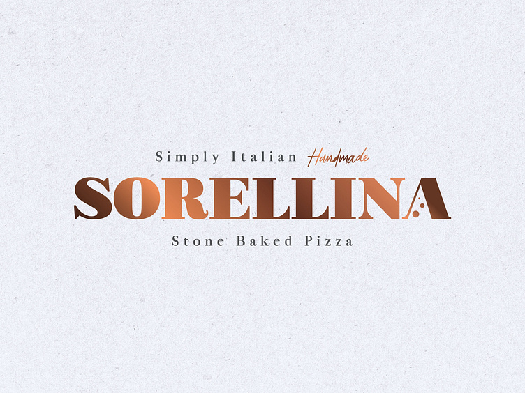
Sorellina Pizza
Simply Handmade Pizza
Pizza is great the way it is. No fuss. Uncomplicated. Simply the way we all fell in love with it. Quality recipes done well.
Nico’s becomes Sorellina
The owner of Oliver’s Restuarant and Oliver’s Coffeebar approached me to create a name and brand for a Nico’s buy over. The parameters set for the product were high-end, quality, uncomplicated and stone baked. The brand had to communicate the values of the product but free-reign was given to establish an appropriate agenda, look and feel. A blessing and a curse!
Pizza is great the way it is!
By outlining the company agenda (as stated aboved, see Simply Handmade Pizza) a good basis for visual communication was established. This approach stems from the Italian ethos that pizza is great the way it is and recipes should be kept simple, letting quality ingredients shine. This then informed the naming conventions and the visual structure, it was agreed that it had to have an authentic Italian vibe. With the restaurant being a sister restaurant to Olivers restaurant ‘Sorellina’ meaning ‘little sister’ seemed appropriate to create a connection between the two that could be played upon when desirable but let the two sit apart for advertising purposes as the service offering differed significantly. By using coppers and dutch cardboard textures we can create a high-end quality aesthetic. Serif fonts create a more classic feel, ideal for the authentic Italian vibe desired. A slight tweak to the letter ‘A’ in Sorellina to contain a pizza slice allowed for the creation of a subtle unique wordmark as well as a brand pattern to be established for various collateral.


