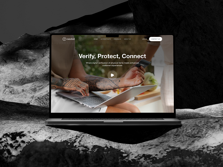
Digital Verification/Authentication Website Landing Page Design
Digital verification should be simple and secure!
In our landing page design, we made sure it is.
Here’s how we did it:
Clean, intuitive layout for effortless navigation
Instant access to key info without the clutter
Seamless verification process, start to finish
The result?
A smoother, faster way to verify identities with confidence, anytime and anywhere.
Wanna see more?
Check out our full case study on Behance! 👉Digital Verification & Authentication Website Design
Looking to design a user-friendly fintech site?
Book a 30-minute call and we’ll make it happen.
📞Calendly
And explore our work ➡️ https://www.behance.net/six_2_eight
More by six2eight View profile
Like


