Data Pulse UI/UX Design – SaaS Performance Dashboard
Overview
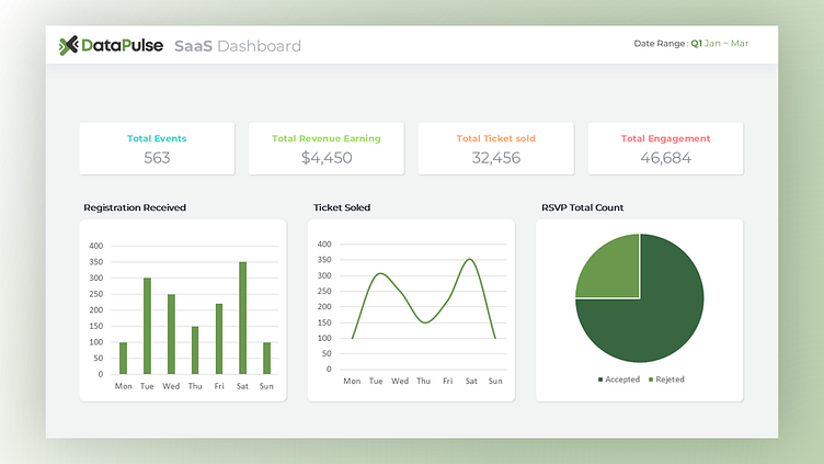
This dashboard offers a clear view of key SaaS metrics like customer churn, acquisitions, and revenue growth. Using charts, heatmaps, and easy-to-read tables, it helps decision-makers quickly understand business performance. The design is focused on making complex data simple and actionable.
Mockup View
Output
We designed the Data Pulse UI/UX to be clean and modern, with interactive heatmaps, dynamic graphs, and easy-to-read tables. The minimalist layout lets users quickly access key metrics like revenue and customer retention without unnecessary clutter. With easy navigation and responsive elements, the dashboard ensures a smooth, user-friendly experience. We focused on making data analysis simpler and faster, so users can stay focused on what matters most.
All Pages View
Color Usage
The design uses cool blues and grays for a clean, professional look, with red and green accents to signal important changes. Green highlights positive trends like growth, while red points out areas that need attention, such as churn or revenue dips.


