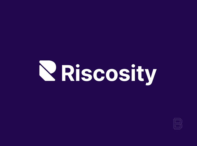
Logo Design For Riscosity
The logo design presented here was meticulously crafted for Riscosity, a cutting-edge data flow security platform dedicated to empowering organizations with comprehensive control over third-party data in transit. Throughout the design process, multiple logo concepts were developed, each tailored to encapsulate Riscosity’s commitment to security and innovation. Ultimately, the client expressed their enthusiasm for this particular design and color palette, which effectively communicates the brand's identity and mission.
To explore more about Riscosity and their services, please visit their official webpage: Riscosity Website.
The logo that didn't take the cut
The following logo concept was one that I personally admired for its representation of abstract flowing lines, symbolizing the seamless movement of data. The outer circle serves as a protective shell, encapsulating the essence of Riscosity. This design conveys the core message that Riscosity actively prevents data leakage, ensuring that clients maintain control over their data.
Furthermore, the juxtaposition of the larger circle and the smaller circle evokes the imagery of the Earth and Moon, with the Moon representing Riscosity itself as it regulates the waves of data flowing across the globe.
However, despite its conceptual strength, this logo was ultimately deemed unsuitable for practical applications such as favicons or small stickers, due to the delicate, thin-lined shapes that could compromise visibility at reduced sizes. As a result, the entire concept was set aside in favor of a more versatile design.


