Souper Branding
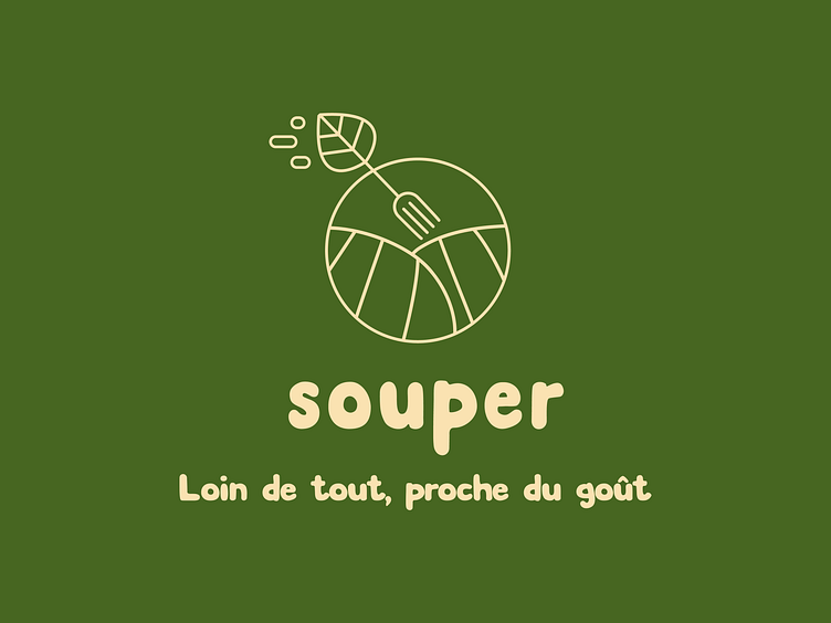
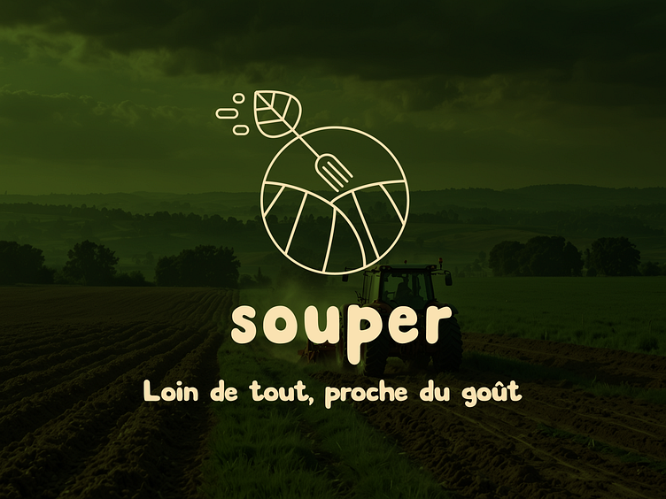
"Far from everything, close to taste"
This is the slogan of this meal delivery service in the countryside: Souper.
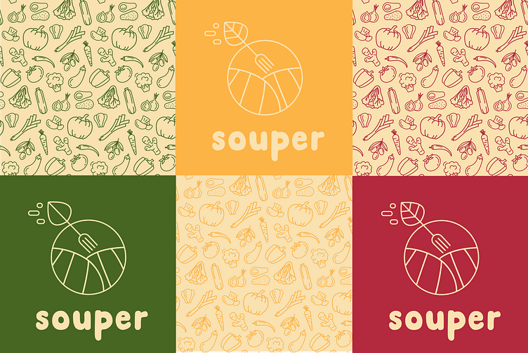
The DA that I propose is oriented towards 3 key points:
- Health: the vegetable patterns and the slogan evoke the healthy side of the products.
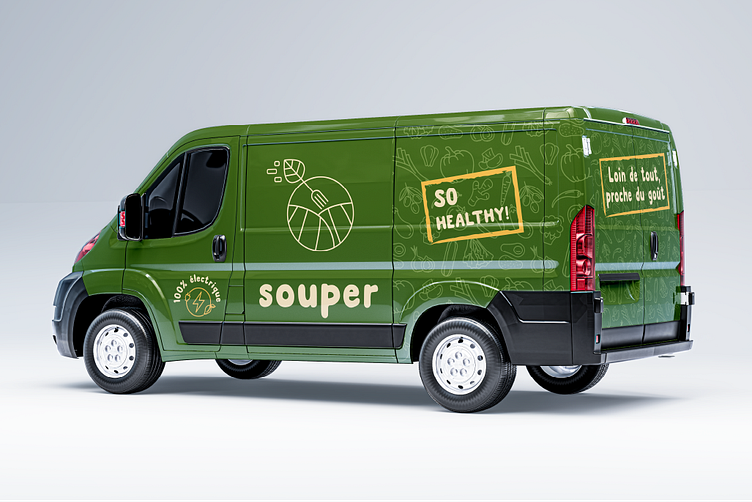
- Proximity: the design highlights the natural aspect, local production, for example with the message "near you".
- Dynamism: I used bright colors to bring a more modern and energetic image.
The logo represents hills evoking the countryside with an arrow that lands in the center of the circle. The arrow is in fact a fork (meal delivery), with a leaf at the end (healthy meals, local vegetables).
The typography is round and soft to express conviviality. The logo is deliberately written in lower case to give this image of simplicity and proximity.


Need a brand design?
📧 Contact me: contact@agenceeclat.com
🌐 Visit my website: https://www.agenceeclat.com/
