Radcom Design System Light/Dark Theme Color Palette
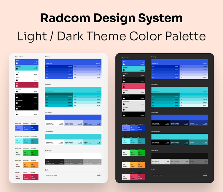
This is a preview of the Radcom Design System light and dark theme color palette.
Overview
This color palette includes primary, secondary, neutral, success, warning, and error colors for both light and dark themes. The number of "A"s assigned to each color indicates the supported level of accessibility.
Date: July 2021
More by Hussein Shirvani View profile
Like
