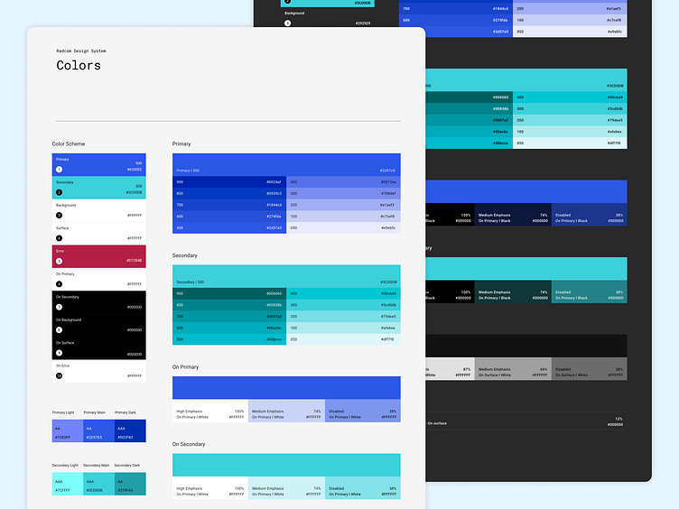
Radcom Design System Color Palette
Project Type: Design System Development
Tools: Adobe XD
Date: July 2021
As part of the Radcom Design System, I designed a comprehensive color palette to ensure consistency, accessibility, and flexibility across the CMS. This required balancing the system’s existing visual identity with modern design principles.
Key Considerations
Accessibility & Readability
Ensured sufficient color contrast to meet WCAG accessibility standards.
Prioritized text readability on various backgrounds for both light and dark modes.
Consistency with CMS Branding
Selected primary and secondary colors closely aligned with the CMS’s established visual identity.
Scalability & Versatility
Developed a wide range of shades and tints to adapt to different design scenarios.
Included accent colors optimized for both light and dark themes.
Outcome
The resulting color palette forms the foundation of the Radcom Design System, offering a flexible, accessible, and visually cohesive framework for future designs.
Feedback is welcome!
Let me know what you think about the color palette. 🙌
Feel free to use it if you like it. 😃
Have a project in your mind?
If you would like to work with me, email some details about your product/project.
