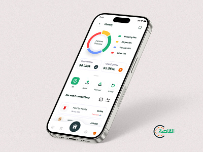
Al-Qaseh History screen
Client Name: Al-Qaseh (E-Payment & Financial Services)
Year of completion: 2023
___________________________________________________________________________________________________________________________________
Designed with user-centric principles in mind
Al-Qaseh payment History and financial summary UI screens offer a visually appealing and intuitive interface tailored to Arabic preferences. The thoughtful use of typography, color (including the client-preferred green), and spacing, combined with adaptable RTL/LTR functionality, enhances readability and usability across different languages and cultural contexts.
The Key Points that we faced and solved effectively
Data Overload: Displaying large amounts of transaction data without overwhelming users.
Solution: Introduced filterable tabs for All, Sent, Received, and Failed transactions, along with a central pie chart for a quick, visual financial summary.
Data Clarity: Ensuring users can easily interpret their financial data.
Solution: Used a clean, minimal interface with color-coded sections and an interactive pie chart, offering key details at a glance.
Transaction filters: Making transactions easy to use, clear and actionable.
Solution: Created four different tabs with clear status icons and explanations, to help users find quickly.
Have an idea like this one?
Let’s collaborate with us🤝, we'll not only create an intuitive and meticulously UI, but it will be UX-based and follow all the principles to ensure your app is not only beautiful but also functional with seamless developer-friendly files.


