Habitbit Logo Concept ver. 1
First concept of the logo for a habits management service — website, app and courses. The logo is based on the main phrase that describes the essence of the approach — “split habit into bits”, which is embedded in the naming in the form of a repeating the “bit” part.

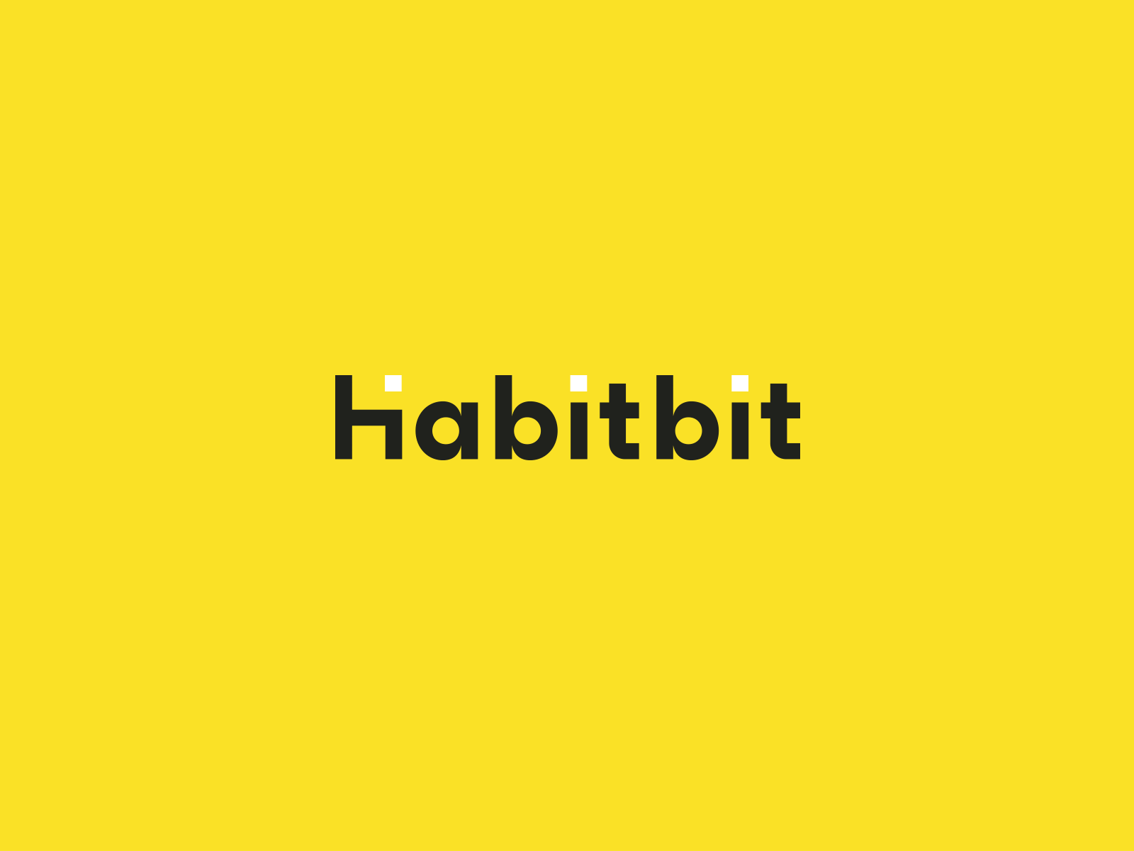
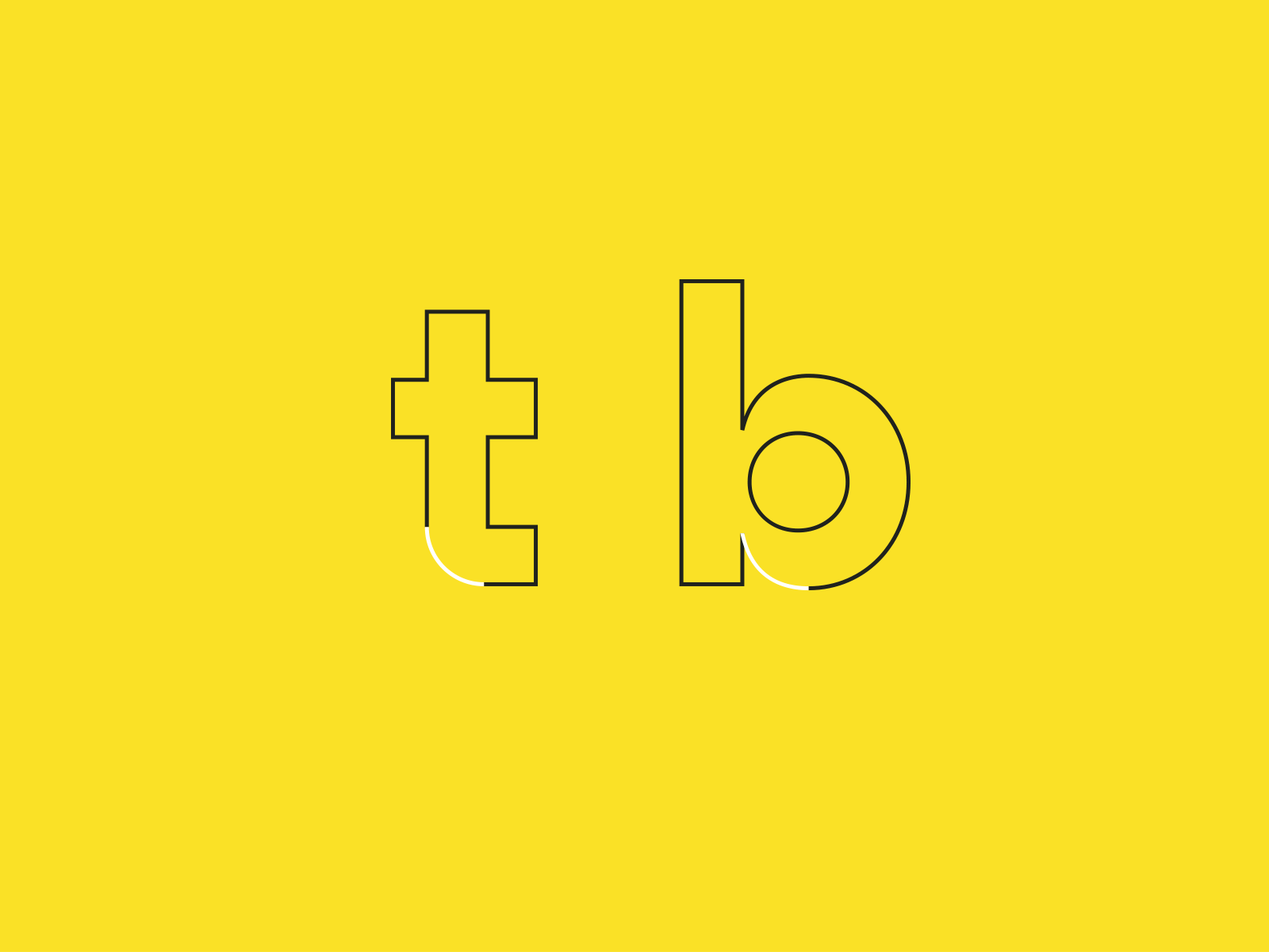
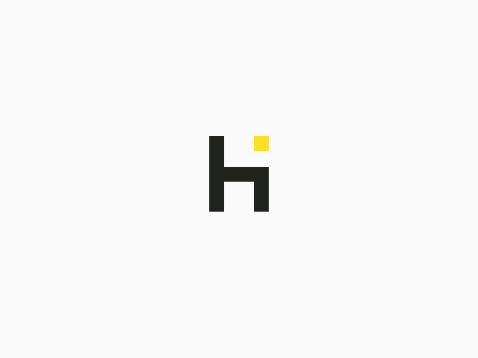
To solve the task, a bit symbol was built into one of the first letters of the name — a square, a dot, as a graphic embodiment of an information unit, which rhymes with a good arrangement of duplicating diacritical signs in the letters, supporting repetition as a metaphor for the functioning of a habit.


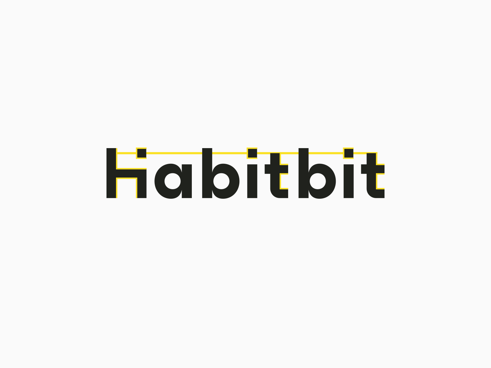
The location of the logo container element is tied to the upper right corner of the layout (the corner of the bit symbol in the letter H), is based on the general grid and is always a multiple of the smaller side of the layout, regardless of its horizontal or vertical orientation.


