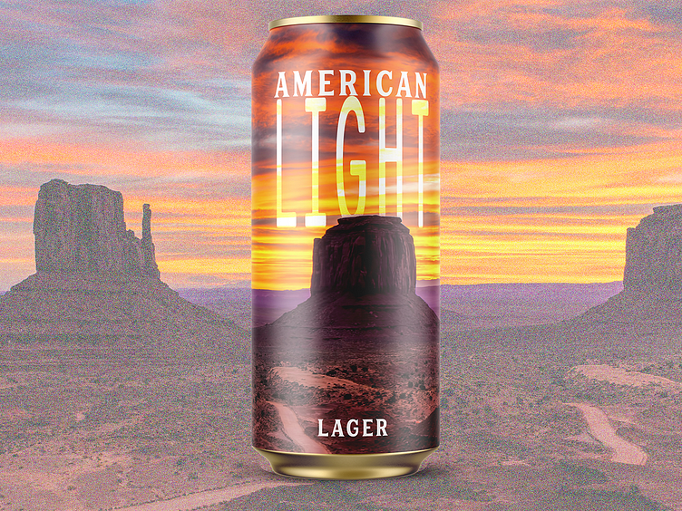
Light Lager - Minimal Beer Label Design
Heading
Enter your text here...
About the American Light Lager
The American Light Lager style emerged in the mid-20th century, developed as a lighter, more refreshing alternative to traditional lagers. It became popular after World War II, when changing consumer preferences leaned toward lower-calorie, easy-drinking beers. With its pale color, light body, and mild flavor, the style has become a staple in American brewing, especially associated with large-scale breweries and mass-market appeal. It remains widely enjoyed for its crisp, clean taste and sessionable nature.
About the Design
This American Light Lager label embraces a minimalist design, emphasizing the theme of light with its striking depiction of a sunrise over a desert landscape. The glowing hues of orange, yellow, and purple capture the early morning sun, symbolizing freshness and the crisp, clean nature of the beer. The large, bold typography contrasts beautifully against the vibrant backdrop, reinforcing the beer’s light and refreshing character. The desert setting evokes a sense of open space and simplicity, reflecting the straightforward, easy-drinking quality of the lager itself.
About Me
I run a design and branding studio dedicated to elevating craft producers, startups, and small businesses. With over 350 labels designed and collaborations with boutique brands across the globe, I offer comprehensive services including full brand packages, web development, packaging, and graphic design. If you're looking to bring your brand to life, don't hesitate to reach out. Explore more of my work and past projects at pinewatt.com—I'd love to partner with you on your next creative venture!


