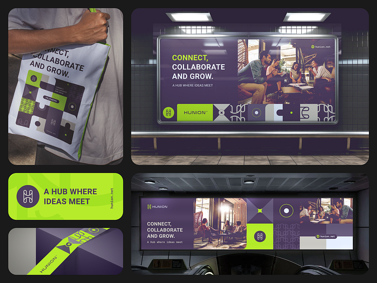
Hunion | Logo & Branding Design
Hunion was born from the perfect union of talent and ideas, aiming to revolutionize creative collaboration. It’s a space where innovation thrives, and every interaction sparks something greater.
The visual identity captures the core of collaboration and growth. The stylized “H” logo symbolizes two people joining hands, reinforcing connection and teamwork. The vibrant green on a dark background embodies modernity and energy, while geometric shapes and lines suggest fluidity and cohesion. Together, the design creates a dynamic and professional image that invites interaction and sparks creativity.
Explore the full project here.
For inquiries or collaborations, feel free to reach out at contacto@brandesignio.com
More by Brandesignio View profile
Like
